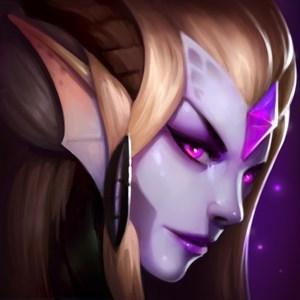
Syndra's face on the snow down art looks really low quality

idk but i think that it looks weird compared to the other 2
idk but i think that it looks weird compared to the other 2
 JellyCone16 votes
I also agree that the face looks odd compared to how she normally looks.
http://i.imgur.com/SHKmZ6u.png
IMO Syndra's most defining facial features are her sort of long/diamond shaped face and prominent chin (with her chin being the most prominent in her Justicar splash). In her Snow Day splash art, her chin is obstructed by her scarf and jacket, which might be causing her to look different. In addition her face as a whole appears to be rounder, and jutting out more than it should from the profile view that is given, her eyes seems to be rounder/further apart, and it might just be me but her nose seems slightly bigger.
Although I wouldn't say it's necessarily low-quality, it does seem less consistent than her previous three splash arts.
(Also idk how images work, so click on the image to see a side-by-side view of her faces from all her skins)
 Enchanté2 votes
IMO I think it's just the matter of perspective. We're basically viewing Snow Day Syndra's face in worm view, which COULD affect the way we catch the image. It is true that her scarf covers a portion of her face, which is also another factor why we (may) interpret the image differently.
Lastly, only one out of three of her splash shows her eyes, which is her classic splash, and in her classic splash she doesn't seem to have pupil/iris, which gives an image of her being "evil". And now in her Snow Day skin, she shows pupil/iris. By doing so, it gives more expression to Syndra, and I think it fits because the theme "Snow Day", with positive atmosphere. Bard seemed to be really happy and kind, while Gnar is playing around with the penguins, how cheerful. Having an evil-looking or angry-looking Syndra just like how she looks on her classic splash would make her unfit with the splash art.
Sorry for the bad english, but this is just what I think :) please do tell me what you don't agree on instead of downvoting. Thank you
 TeCoolMage1 votes
I think it looks a bit more like Ashe in a way, now that I look at it again
 Rico Nasty4 votes
Riot's had a problem with side profiles on skins recently. Victorious Sivir, new Fiora splash, now this skin
 A Liberal3 votes
To be honest, the entire splash is a disappointment. The skins are beautiful but with the ultra high quality we've been getting recently, this splash is kind of meh.
 MF is my Waifu2 votes
I agree.
 Kaipop2 votes
I don't like how she has black pupils, should be just completely purple like base.
 Maratsune2 votes
Rather than her face, her waist/hips/torso look a little off to me... hm...
 Nox Fatum2 votes
I couldn't be more happy when I heard that new Syndra skin is about to be released, but now when I am looking at her splash art - those eyes and porcelain, plain face I am not willing to buy her anymore.
Especially in a comparison to detailed face of Gnar she looks like a fake doll from a flee market.
 FBI Surveillance1 votes
Syndra has a generic-looking face anyway. To me, her defining features are her crazy headdresses and her balls. You're right though, something looks slightly off about her face but I can't pin it down. Maybe it's just the lack of helmet? Kickass skin though.
 TheFameAnimal1 votes
Agreed, I guess she looks less menacing in the snowdown splash because of snowdown and Christmas and that, but her face just looks off and the splash art looks quite muddy and low quality. :(
 Zeal Seeker1 votes
Her face is a lot wider than it normally is.
 Farm Mana1 votes
I agree. As a Syndra main, I don't think I'll buy this skin.
 luxluin1 votes
I love Syndra and i think this skin is a crap... I will never buy her. No way. I'm very disappointed.
