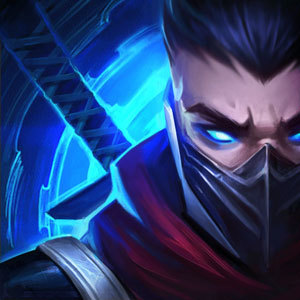
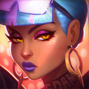
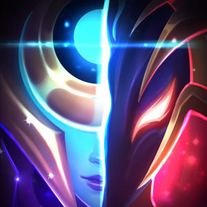
Conqueror karma splash: Its heartseeker Lucian all over again
Xodiathe4bdn1··18 votes·4,956 views

http://i.imgur.com/YghIUUv.jpg I swear some artists purposely do this to get unnecessary rise out of people

The issue would not be so big IF IT WAS GOD DAMN consistent with the other designs Karmas apoearance in game and in the her icon are very different to her new splash https://68.media.tumblr.com/54c5231479b9d99c5c05fb4bc67360e2/tumblr_oo0qtrOy5X1qgrdiqo3_400.jpg

https://cdn0.vox-cdn.com/uploads/chorus_asset/file/8288045/karmaturn.jpg

If your going to make a pale older version of karma then at least make sure it's consistent with her other designs

You go off and change it drastically for artistic effect then you know it's going rub people the wrong way and give them an excuse to go political about it

Hopefully enough people will complain about this enough for them to change

24 Comments

BananaSlayerAMO10 votes

The icon looks awful and not like Karma at all. There was so much potential here to make an icon for the new Conqueror skinline (the original PROJECT icon is still one of my favourites). The jewel behind her head would have been amazing.

That said, her in-game model is smashing. Riot should change the other two, if anything.

Sexy Jack Rabbit3 votes

I don't mind the model so much. It still does just feel like a recolour of her classic to me though, but they're not asking 1350 for it though so Shrug really.

The splash-art on the otherhand is a load of tripe. She's ugly, pale, way too skinny, and most importantly looks NOTHING like Karma at all. I'd seriously appreciate if a rioter could address this tripe.

I'm not going to comment on the icon because tbh I expect a LOT less when it comes down to those. It's not the WORST icon we've ever seen, but it's still pretty horrible. Have you ever looked at the Super Galaxy Shyvana Icon? It's actually hilarious. They should have made it the crystal on her back or the trophy instead.

Furor Nexis2 votes

{quoted}

The splash-art on the otherhand is a load of tripe.

Not the greatest, no. But it's not entirely god-awful. It could be worse. Remember Heartseeker Lucian? Now that was a travesty! This splash art is nowhere near that level of awkward design.

She's ugly, pale, way too skinny, and most importantly looks NOTHING like Karma at all.

I'm half tempted to post all of her splash arts alongside the conqueror one to dispute her 'skinnyness' if you'd like. And it looks like Karma my dude. Who's actually gonna walk away from this and say 'oh is that a new skin for x champion'? It's Karma. It looks like Karma. It uses the same attributes as Karma. The only part of her exposed skin that's 'pale' is her face, which is just really bad lighting / shading. The rest of her exposed skin is her normal skin tone.

I'd seriously appreciate if a rioter could address this tripe.

It's not tripe. It's not the greatest splash art ever but it's not total garbage. It could use a touch-up and some correction in perspective shading and lighting and that's all it needs.

Sexy Jack Rabbit2 votes

Opinions though lol. I've seen you defending this splash anyways, but this is just my view.

I don't think it looks anything like Karma, and I honestly didn't hate the Lucian splash. Her skin tone isn't consistent anywhere.

The skin tone of her back and hands is also too light.

It ranks up there as one of the worst splashes we've seen in a while. I'd be happy to see it completely scrapped, but I know that won't happen so I'll just settle with some major touch-ups.

Furor Nexis1 votes

While I'm in no regards fond of the splash itself, I think it's taking far more flak than it deserves. It could definitely do with some work to it. The Heartseeker Lucian was kind of ghastly when it first came out because it looked genuinely unfinished.

Lexyy2 votes

I'm sorry, but in my opinion... splash art doesnt look like karma. Compare this one to the winterwonderland one.... it's a different character, and im not talking about the skin color.

I like the skin though.

Poppystar3 votes

Yeah I'll agree that this splash is a tragedy. She just got a splash art update and this looks like a splash art drawn up in season 3 of league. it looks nothing like karma at all and the proportions are terrible?

Kitty Cat Tosha2 votes

I do not like the splash art either. All her other splashes represent peace and tranquility. This one is a maniacal mage about to shoot liquid plasma up your butthole just because that is what she does on a saturday morning.

I like Karma, I don't like these artworks unfortunately.

Lexyy1 votes

Battle mage

OverpoweredSoap2 votes

That splash looks really "meh" and her proportions are off too.

And then when you compare it to her recent splash update and.... it just looks really bad up next to those.

Xodiathe4bdn11 votes

I know right It feels like a completely different champion I know each splash sets its own tone and theme but this really doesn't feel like a karma skin

Xosra2 votes

Ok for though who hate the splash for her lookin like an evil mage the name of the skin says why. This karma is a conqueror and she is not the kind tranquil karma we usually see. She should not look peacefull in any stretch. Think of this as if karma sided with syndra same sort style going on flaunting their obvious power over others.

Trading Aces2 votes

Yea, I don't see the issue. Her skin color's pretty much the same in the splash. Maybe you're jumping to conclusions here. If you look at the light sources you can obviously see why her upper body is "paler". If you look at her leg you can see that it's a darker shade of brown. Shit's pretty consistent if you ask me. Further away from the light source, the darker things'll get.

Y'all just care too much about weird shit.

Digielf1 votes

In the splash art she is in action scene while in icon she stands calm

lofi n chillhop1 votes

I swear I have facial recognition issues, I think every human looks like the goddamn same person. and yet I still have trouble figuring out skins are what champion, because they look so foreign to the features of the original champion.

Lexyy1 votes

It really doesnt look like the same champion (comparing winter wonderland splash art to this).

Dont know what to think.

I mean I'll buy both regardless, I main her, but I feel something is off, too.

Edit: I like the model in game, just not the splash art.

Edit: she looks like a man on the splash art ahaha

Nicktoons1 votes

What happened with heart seeker lucian?

Xodiathe4bdn11 votes

Look at the original design they had for heartseeker Lucian then you'll know what I'm talking about

Ozzie Storm1 votes

Nothing, just this http://pm1.narvii.com/6334/ddea8cbcf3faf8a0a7646ef83c731415ee9c6c4b_hq.jpg His old face still cracks me up xD

Arkhan1 votes

Just like the Heartseeker Lucian skin, it was just lighting effects. No matter your skin color, when light touches your skin, it will appear... (say it with me)... lighter.

Sukishoo1 votes

No it's not.... god it's no where near how awful that ++++ was. His had the worlds most F'd up Eyes and lips. Hers actually looks like a person.

ZURELL1 votes

what's the problem with this again?

UomoAfide1 votes

More from Story, Art, & Sound

More by Xodiathe4bdn1