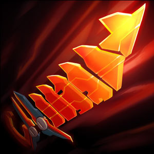
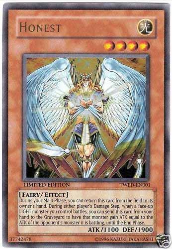
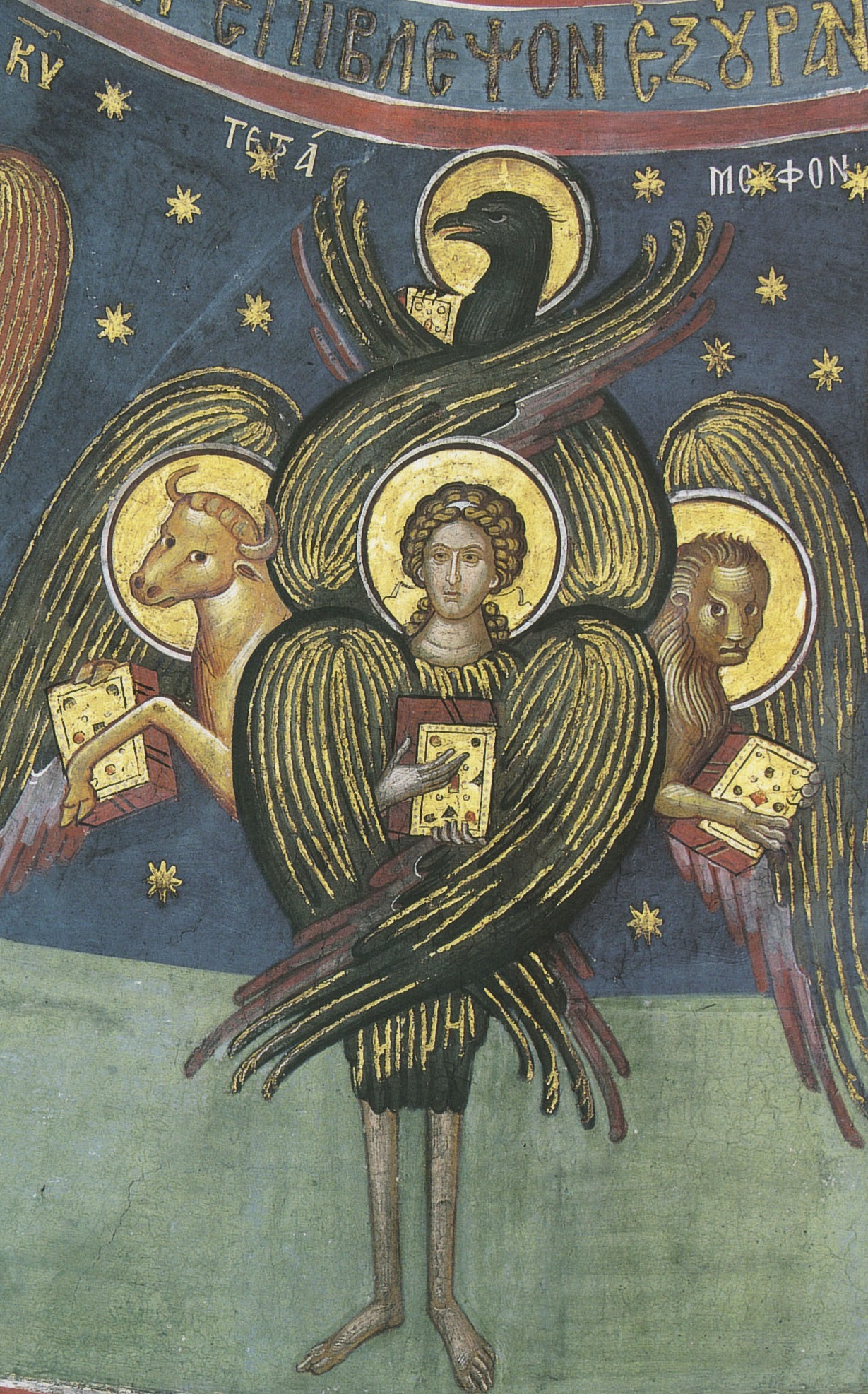
Does anyone else think the new item art doesn't fit the art style?
Sorry but I think that the new item art looks like it belongs in Yu Gi Oh. I mean come on.
 Looks like
https://images-na.ssl-images-amazon.com/images/I/51IBc1KTlRL.jpg
Looks like
https://images-na.ssl-images-amazon.com/images/I/51IBc1KTlRL.jpg
Sorry but I think that the new item art looks like it belongs in Yu Gi Oh. I mean come on.
Looks like
https://images-na.ssl-images-amazon.com/images/I/51IBc1KTlRL.jpg
 Deep Terror Nami3 votes
I thought it looks pretty awesome, but then again I also enjoy me some Yu-Gi-Oh.
 PearPearadox1 votes
I know I think it looks badass too, but I just don't think it fits the art style of the other items.
 DrCyanide1 votes
It looks like a sword with wings to me. You imagine the hilt to be a head because of where the image cuts off.
PearPearadox1 votesLooks similar tho
 Dokkaebi1 votes
Items are supposed to look different for clarity.
 Placentas1 votes
I agree actually. I saw it in a match last night for the first time and I think it's cool, but it's really...different. I need to look at it again tbh, but it definitely stands out.
 Furor Nexis1 votes
Yoooo hit me up with that League of Yu-Gi-Oh anyday.
Realistically I think it's fine. GA's icon has been super outdated for a while and I think the new art is more fitting, given it's namesake.