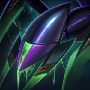
Clarification on Splash Art/Champ Icons/Art Direction

Can someone explain the recent splash art changes and icon updates in terms of the general art direction the league is headed?
It seems that not long ago the general direction of champ design was more humanistic rather than cartoonish, yet the latest splash updates and icon recreations lead down the latter path.
I don't have an issue with either direction, if all art is geared to the same result, but the latest updates seem to clash horrendously with previous splashes.
A few come to mind, but Udyr's latest icon looks more like sasquatch nunu than the man-bear-tiger-turtle we all know and love.
Just looking for some clarification on the new direction league is taking as the art changes along with gameplay updates (A LOT AT ONCE) are starting to turn me away with the lack of cohesion and clear direction.