Riot What You Did To The Champion Icons Is So Stupid

Nearly all the images for updated champs are glossy looking change the way the splash art looks like some of them are so disgusting aka J4 and don't get me started on Kog'Maw (completely changed the shape of his face) 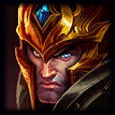
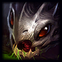 Thats my rant sorry please switch it back some of them are fine others need fine tuning or tweaks

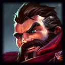 = someone shined his head like a shoe
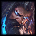 = literally chopped off half of my favorite champions head for no reason
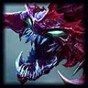 = what was the point in making him look more saturated? Nothing intimidating looking is this shade of red or purple or whatever this is.
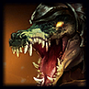 = I hate when Riot turns the face of the champion. Now it doesn't even match the actual art come on what is the point?
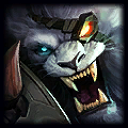 = way worse. Who at Riot said "lol hey let's zoom farther in it will look better guys". Next time I take a selfie I'll just include my eyes, nose, and mouth I guess.