Some chinese splash art are downgrades to our current splash arts

CDZoro·4/5/2016, 8:59:41 PM·115 votes·18,518 views

Seriously Riot, not ALL splash arts should be changed.

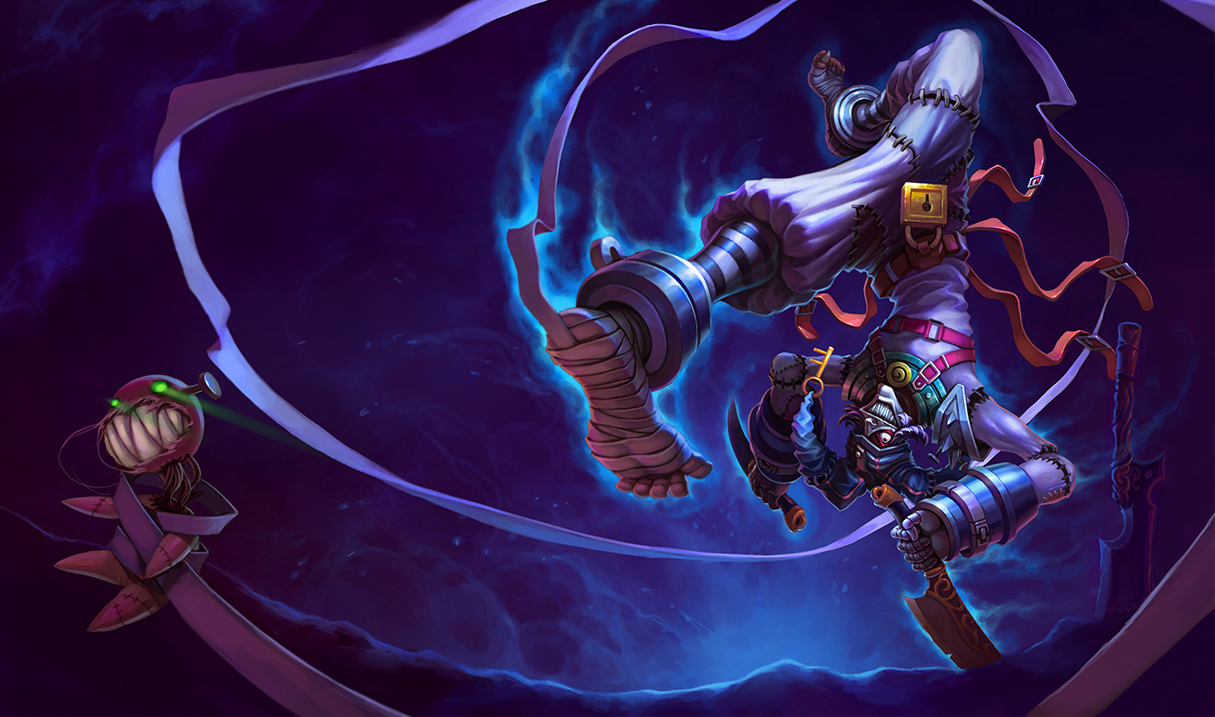
Example: Renegade Talon Chinese art looks like Singed and looks more of a fanart. https://2.bp.blogspot.com/-gM556lzCWPI/VwQKES40koI/AAAAAAAANAU/7-EUwp90mdwOB2Ax4CaxF9MyymI4JuCCA/s1600/Talon_Splash_1.jpg

Current Renegade Talon at least look human... https://i.imgur.com/XpcQgPX.jpg

Another example:

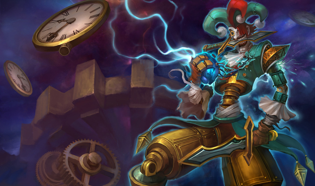
Groovy Zilean Chinese art looks like an evil goblin what the hell? https://2.bp.blogspot.com/-LZUKO1hFoJE/VwQKI-oKjvI/AAAAAAAANBo/rpZ-QIAs3fQUxKBLHw-suZjyQWnlq54ag/s1600/Zilean_Splash_2.jpg

Current Groovy Zilean DOES look like a happy hippie http://static.lolskill.net/img/skins/1215/zilean_2.jpg

As for others are indeed an upgrade but those 2 are just an example of how bad some chinese art look and does not fit at all with the others. I also personally dislike the fact that some female champion splash art look like anime fanarts (I'm not against anime) but the anime looking splash arts does not fit with the current art at all... not saying the old ones do but the coloring and style would fit more than anime looking art. Many of the chinese art are too bright and colored compared to the NA ones...

example: PAX Sivir chinese looks just like a fanart on deviantart https://3.bp.blogspot.com/-Z3iV7a3tZn4/VwQKDnLzohI/AAAAAAAANAI/49NGZ7oV0y0DtBmlZ_FkMAOGtC6l8l_DQ/s1600/Sivir_Splash_5.jpg

Current pax sivir looks way better imo and does look more like the ingame model https://36.media.tumblr.com/95a7cec2f50b0657e48f19b9a180ea2c/tumblr_n16fpp4sOi1t1opl8o2_1280.jpg
132 Comments

CDZoro4/5/2016, 9:16:26 PM49 votes

Guess what bois

Graves cant have his cigar back right?

Now Gentleman Cho got his pipe removed.

NEW: http://i.imgur.com/XfnXiHK.jpg

OLD: http://i.imgur.com/fh20pEK.jpg

Here's the full gallery of today's PBE Update NEW vs OLD. https://imgur.com/a/rmsrB

SimplyLyrical4/6/2016, 4:37:38 AM15 votes

[deleted]

Catastrop4/5/2016, 9:25:09 PM8 votes

The new Talon splash looks like Singed trying to cosplay as Talon but Groovy Zilean looks pretty dope imo.

Helmight4/5/2016, 10:40:03 PM8 votes

All chinese splash art are downgrades to our current splash arts

ftfy

Captain Aishi4/6/2016, 12:36:02 AM8 votes

roughly 90% of the splash arts they are replacing are straight downgrades... 'Some' is starting to be an inappropriate choice of words

LazyW0lf4/5/2016, 9:15:12 PM8 votes

Can we just look at how Twitch was changed? They look nothing like how he looks pre or post rework. I'd rather have what we have now than that garbage.

ZT Xperimentor4/5/2016, 9:12:52 PM7 votes

I said that about sivir & ahri too when they were changed, but it was ignored :/

kDrakari4/6/2016, 3:34:14 AM7 votes

I didn't mind the splashes people complained were "too anime" in the last batch, but most of the Sivir splashes have reached that point even for me. I actually don't mind the PAX Sivir one, but the Warrior Princess Sivir splash becomes... completely random anime? It COMPLETELY loses every single piece of the original splash and replaces it with something unrelated. The other ones aren't good either, Spectacular Sivir doesn't feel like it relates to classic American comics anymore (though I could be completely wrong about the original in the first place), Huntress Sivir doesn't feel at all "Primal" and the background makes no sense. Bandit Sivir is fine, I guess.

Groovy Zilean is my biggest complaint though. All I can assume is that Tencent went "This guy looks like he might do drugs, but doesn't also look evil in order to make drugs seem bad. Let's change that."

Lunastria4/6/2016, 4:27:51 AM6 votes

have you seen how wierd the midnight ahri one is. It's super disproportional to a real person which makes it look super awkward NA: http://images6.fanpop.com/image/photos/36200000/Ahri-image-ahri-36205350-1920-1080.jpg Chinese: http://art-of-lol.com/wp-content/uploads/2015/03/video_games_league_of_legends_ahri_1366x768_70929.jpg

Jet Sett4/6/2016, 1:57:16 AM5 votes

Lol Renegade Talon should look like Talon before the Noxian assassin business, not some shadow wielding swordmaster that lives in a sandstorm. Don't get me wrong, it looks cool as hell, but it doesn't fit what I feel it should represent; Pre-assassin Talon.

Autrah Fang4/6/2016, 3:22:13 AM4 votes

honestly... i first saw the Chinese Renegade art about a year or 2 ago, and i honestly thought it was a fanart all the way up until today, when i saw that it was the proposed change for the splash art... the NA art fits so much better. (even though the Chinese art does look more badass)

Solari Fortune4/6/2016, 4:20:07 AM3 votes

I'm ok with the Sivir art changes because she is scheduled for the Splash Art update Nid Trundle and Trist are getting

Caitlyn Hunt4/6/2016, 7:18:37 PM2 votes

they're picking based off quality only. i think we can all agree their pax sivir looks better. maybe doesn't look like sivir as much, but oh well.

japan hate acc4/7/2016, 1:52:48 AM2 votes

As a Talon main, here's my feedback on the new Talon skin splash. In some essences I could see how it is better, his body is more proportional (sure, his legs are kinda long/thin in the new one, but in the original he looked like a hunchback), and he looks meaner. However, it doesn't capture the thought behind the skin in the first place. Renegade Talon was supposed to be Talon when he was living in the streets, before he was found, before he joined the Crimson Elite. His gear was supposed to be improvised. Note the torn jeans with tape, the too big sneakers, the kitchen-knife blades. Now, in the new one, this is all gone. His blade is longer, more professional, so are the blades. He looks older, and less desperate.

Also, the slums of Noxus are evident in the old one. In the new one, it is a brown background with (ink?) marks and slashes, giving it a HUGE fanart feel. Overall, I feel like neither skin really fits, and it needs a completely new splash altogether.

This does not go for just Talon, either. Plenty of splashes need new ones, not just different splashes.

Just my two cents.