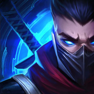
Absolutely LOVE the Temple Jax change!

http://i.imgur.com/lbhmBSc.jpg

This skin is just amazing, through all the uproar about some of the skins changing, some for the better, some for the worse.... I think this one is definitely for the better!
http://i.imgur.com/lbhmBSc.jpg
This skin is just amazing, through all the uproar about some of the skins changing, some for the better, some for the worse.... I think this one is definitely for the better!
 Kasyrgan5 votes
Imagine if he had a real lamp post.
 ViashinoWizard3 votes
Jax confirmed for Street Fighter V
 rtbf2256182413 votes
But IT LOOKS LIKE FAN-ART! This doesn't look like Riot's style at all.
 Kar98k2 votes
Kung Fu Panda JAX
 DorkunedAuras2 votes
It would be all 6 warriors from the movies wailing at him, with Jax dodging everything and beating them to a pulp.
 lunien1 votes
It's pretty awesome.
 Amoc1 votes
I don't understand what Riot's plan is here. I mean, I like this skin too on its own. It's a pretty cool Frank Milleresque comic book style drawing. Unfortunately it makes no sense why it's called "Temple Jax" anymore and it diverges wildly from most of the rest of Riot's art. The idea of "unification" just doesn't hold up with skins like this.
 GreenLore1 votes
The name still makes sense,you don't need to show a temple in the background to make him look like he belongs to one,I mean most bloodmoon skins don't have a bloodmoon in their splash arts,but that doesn't mean the name doesn't make sense.
Also its mostly about unifying the splash arts of china and the rest of the world,having different splash arts in different regions likely creates a bit more work and its not like the splash arts that are replaced fit into the current art style either(don't misunderstand this,they don't see this as real splash art updates,the chinese splash arts are also going to be replaced eventually)
Amoc1 votesBlood Moon is a specific theme that by now we're familiar with. It's Red/Pink (Blood) and Glowey (like the Moon). We know what it's supposed to look like.
Anyways from this splash art Temple Jax is called Temple Jax just because. There's no identifiable theme or direction for it. It's just a badass comic-book style drawing of Jax. It looks cool, yes, but it seems pretty divergent from Riot's other skins, let alone just Jax.
GreenLore1 votesEven the very first bloodmoon skins didn't have an actual blood moon in their splash arts...
And the current splash art also clashes with riots new art direction,so where is the big problem with it?Riot has the ability to choose from 2 outdated splash arts,so they simply take the one that looks better in their opinion
Amoc1 votesI don't think there is a big problem with this one. Like I said, I think it's a cool skin. I just think that it is inconsistent with the reasons Riot has given us for some of the other updated skins. This is a wildly diverging style and doesn't "unify" much of anything.
GreenLore1 votesThe thing is that there are 2 different unification-goals for splash arts https://4.bp.blogspot.com/-MxI4aNom9F4/VvXC90iH6WI/AAAAAAAA5PY/9hJtO0lGTrEmeWsS6bFLStF1djEwddszw/s1600/CebYojxUUAE5aDK.png
The champion/splash updates (1&2 in that picture) are about making new splash arts,to unify the art-style/quality of all the skin splash arts
The global splash update (3 in the picture) however wants to unify the splash art use,so that all the regions use the same splash arts,its an enitrely seperate goal from the one of the first two.
Amoc1 votesYeah I get that, and I'm not advocating they keep the western Temple Jax. It was bland, ugly and I doubt anyone used it anyways. It's just that the new Jax skin (being so unlike the rest of Riot's art) kind of shows how arbitrary the global splash update is. We're picking the Chinese Temple Jax because it looks cool (even though it doesn't "fit" the current art styles), but then we're also picking the chinese Nightraven Fiora and Sun Goddess Karma over the strictly better western ones...because well...unification.
GreenLore1 votesDifferent people different opinions. Appearantly someone at Riot thought that the chinese versions of these look better than the current ones,thats all.
Heck while I've seen lots of people complain about these 2,there are also those who actually like the new versions better.
Amoc1 votesHeck while I've seen lots of people complain about these 2,there are also those who actually like the new versions better.
Perhaps they do, though it's pretty hard to see why. In these two instances the drop in quality is noticeable. Higher resolution doesn't somehow automatically mean better.
 snake patroller1 votes
I absolutely love the ink splotches!
[zombie-nunu-hearts]
 XeroKimo1 votes
This totally looks like a world of warcraft box art
 Emperor Time1 votes
hmm i'm kind of torn on the chinese arts. Some of them look like fan art, but masquerade Evelynn's ass is so good.
 Krizalid1 votes
He looks like a Street Fighter character here.
 LostSoul6661 votes
I always loved this version better. Some of the splashes look amazing...while others just look god awful.
 Primadonna1 votes
It looks like fan art to me.
 Headbiter1 votes
This doesn't relate solely to the reactions to the Jax-artwork (in fact, I like both the current Na- and the Chinese-artwork, they give away very different moods) but I love how I read "fan art" so many times when the official "professional" art of late suffers repeatedly from bad perspective work, absolutely fucked anatomy and overproduced photoshop-surface effects. In short, what fans of the game so often decry as "it looks like fan art" is so often executed WAY more professional than the "professional" art (and that absolutely includes the dreaded Nightraven Fiora-skin).
I know people make this out to be a "Chinese vs NA"-thing but really, if we'd get some of the beautiful handdrawn western artworks (think previous Riven, Shyvana) nowadays we'd probably get the same "fan art"-nonsense response.
 LOL Spammer1 votes
The one jax skin I've bought!!! Yeet can you link me to the changes?
 HollowJackies1 votes
his skins really kills his joke
 kile1472 votes
"Imagine if I had a real skin!"
