Gold Icon
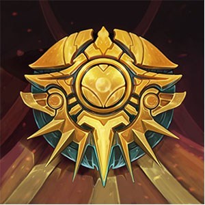
The gold icon is so ugly...The one from s3 looks 100x better, like I'm ashamed to put it up because of the way it looks.
The gold icon is so ugly...The one from s3 looks 100x better, like I'm ashamed to put it up because of the way it looks.
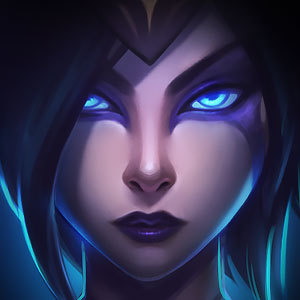 Featherztorm3 votes
I understand what he means. It's not the fact that we made it to gold and get an icon to show our work, but it looks a little bland. I almost mistook it for a bronze icon when I first saw it, truthfully. I'm not complaining about having it, just wish it was a little more shiny, maybe?
Featherztorm1 votesI understand what he means. It's not the fact that we made it to gold and get an icon to show our work, but it looks a little bland. I almost mistook it for a bronze icon when I first saw it, truthfully. I'm not complaining about having it, just wish it was a little more shiny, maybe?
But let's be real. This is what we're really after!
 Useless Ali gg1 votes
I understand what he means. It's not the fact that we made it to gold and get an icon to show our work, but it looks a little bland. I almost mistook it for a bronze icon when I first saw it, truthfully. I'm not complaining about having it, just wish it was a little more shiny, maybe?
Yes this is exactly what I mean. It's so similar to the bronze icon. IT needs a more deep shiny yellow color
 Onegarion1 votes
You're ashamed to show that you reached gold? Don't think it really matters exactly how good it looks more about the weight it carries.
Useless Ali gg1 votesYou're ashamed to show that you reached gold? Don't think it really matters exactly how good it looks more about the weight it carries.
True but even the silver icon looks much better
Onegarion1 votesIt does look rather blah, but I take it less about what it looks like and more about what it stands for. I could say some things about it being bad, but its out and I'm just proud to be gold. That and the skin is what I really care about.
 Drunk Rummate1 votes
meh i have icons that i paid for that i prefer using anyways.
 BeatzBoyFTW1 votes
I'm Silver, and I <3 my Silver icon, thank you very much.
Featherztorm1 votesI'm Silver, and I <3 my Silver icon, thank you very much.
Hell compared to the Gold one, the Silver is nearly blinding! I'm jelly.
 Tehemai1 votes
Yea the gold icon really looks like garbage, even the silver one looks cooler.