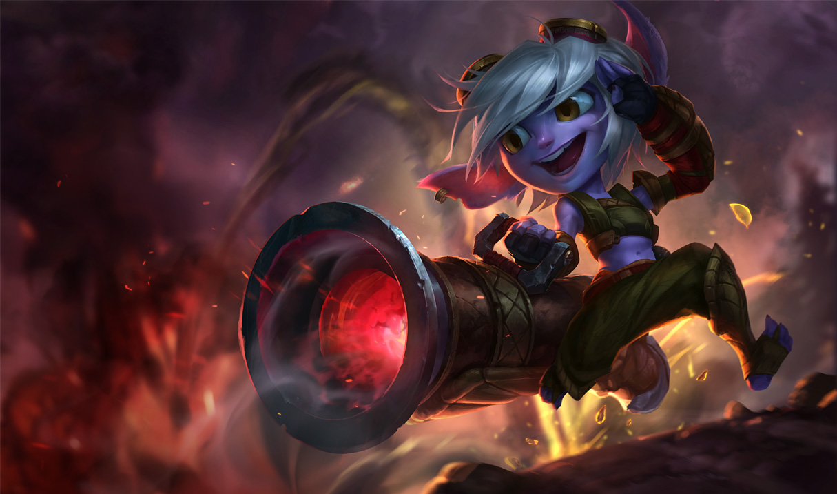
New Tristana art
1/22 PBE Update: New skin splash arts, New Tristana splash art
Share your thoughts on the new Tristana. I personally liked the previous art for her and would like it changed back.
Share your thoughts on the new Tristana. I personally liked the previous art for her and would like it changed back.
 JamDubs2 votes
It has its problems. The old one had its problems.
I feel like the old one captured Tristana's attitude better, but it was artistically not quite on par with the rest of the (recent) splashes in the game. There was also a small case of derp in her eyes, and with the new splash it's confirmed that Tristana is in fact covered in fur which was definitely not the case in the old one, etc. etc.
But, the new one has its own issues. Zoomed in, her face doesn't look all that bad- zoomed out, like in her icon or even in a loading screen, her furrowed eyebrow that is very necessary to discern her expression is difficult to see, and she comes off looking... Odd. Plus, her face in general is just too wide. Plus, the ankles are sticks, her left wrist's padding was nerfed etc. etc.
Personally, I'd prefer they go back and fix up the first swing at the splash. I actually did an edit myself to try and fix a couple problems, but I hesitate to share it.
 Rafael Merlo1 votes
It has its problems. The old one had its problems.
I feel like the old one captured Tristana's attitude better, but it was artistically not quite on par with the rest of the (recent) splashes in the game. There was also a small case of derp in her eyes, and with the new splash it's confirmed that Tristana is in fact covered in fur which was definitely not the case in the old one, etc. etc.
But, the new one has its own issues. Zoomed in, her face doesn't look all that bad- zoomed out, like in her icon or even in a loading screen, her furrowed eyebrow that is very necessary to discern her expression is difficult to see, and she comes off looking... Odd. Plus, her face in general is just too wide. Plus, the ankles are sticks, her left wrist's padding was nerfed etc. etc.
Personally, I'd prefer they go back and fix up the first swing at the splash. I actually did an edit myself to try and fix a couple problems, but I hesitate to share it.
Please, share. Speaking of me, I will not put any destructive criticism on it and would love to see your take on it. But I really wished to see it reverted to the one before the actual :/
JamDubs2 votesWell, aight. I just hesitate because it's such a small edit. All I really edited was the smile a little, fixed the derpy eyes (but made them larger and rounder, apparently a point of contention) and added a fuzzy texture. Also I stuck her in the new splash's setting, but that was just for fun.
Compare with >this< because I scaled her up and it's otherwise a pain to directly compare the old face with my edit.
Rafael Merlo1 votesI liked the minor corrections. Your changes in light of her eyes made help to her to look behind (to the explosion she did) and not to the ground (nonsense). Plus the furry, nose and theeth made her more feral, as I believe yordles (male and female) to be. And last the livid red in her cannon is much more appealing.
Even with all this, I'm still with the older. Why? Cartoonish drawing. It simply doesn't fit the game, the character, the environment and the context of the scene. I would say that the sketch idea of the splash is good, but the execution was so mis-styled that only redrawing it would solve :/
 5G8Nri0B542 votes
Which is which?
Personally I feel this one is superior overall. Admittedly the face could use some work, but it's not as bad when taking into account that she's a yordle.
 Dolfanatic1 votes
They really shouldn't have started trying to change it. I thought the original looked better than both attempts tbh.
Rafael Merlo1 votesThe actual one is excessively cartoony. Her face seems disformed and I feel bad because it's a CLEAR lost of quality compared to the one before it.
 TheSeltzerBaron1 votes
I didn't get to see the previous one but the one before that was just horrid so I'll take either one. Very pleased with the update.
Not sure if this link works but this is the one I mean. This
Rafael Merlo1 votesThis is the one that we feel that is the better, not the one after it (the actual).