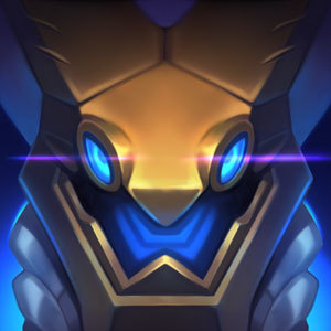
New splash art (mostly icon) review
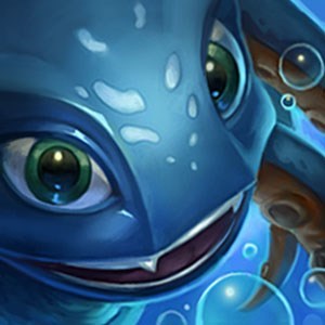
I might be the first to say it, most of them are not an improvement. Some are awful. Not as in....terrible , it's just most of them are worse than the original, in my opinion. I don't know if you guys hired a new design team but I miss the classic skins/icons. It just doesn't feel right to match that with the in-game visual of the champion.
The Good: Passing marks go to Caitlyn, Vayne, Karthus, Jarvan IV, Talon, Veigar, Shyvana, and Blitz. Those actually look better than the previous. Pretty badass as well and fits their description.
The fails:
- Lee Sin. When I see that champ picked in champ select, I immediately go, what the fuck happened? He use to look decent, now its too life like.
- Singed. Give me back the old one. This guy doesn't look like a mad scientist, he's hideous if anything.
- Shaco. Any common LoL player would say his look is like a major fhaget (pardon my french) right after checking him out now, please revert it if possible.
- Renekton. Why is the icon of his head so small? Art is 5/10
- Wukong. One of my mains, he's okay until you see his icon.
- Ezreal. No explaination needed, just check out the icon, it's too life-like.
- Cho'gath. Worse than original.
- Kayle. You ruined it. He looks awkward.
- Rumble. Judging from the splash art his head is tilted. Why is it straight on the icon?
- Shen. Dear god, just redo the face, Halloween is over.
- Cassiopeia. That art, fire the guy (just kidding, but its not even close to be as good as original). It's facing the opposite way of the regular art too.
- Urgot. LOL didn't think it could downgrade.
- Malzahar. Just admit it, the old one was cooler. This one is too asian (i'm chinese, so not being racist).
- Malphite. Can't put it into words. Not rock solid enough :^).
The mehs (not any better than original, but not worse...time could've been better spent elsewhere): -Janna -Zilean -Udyr -Akali -Renger -Orianna -Tristana (She looks like a distant relative to Jinx now lol) -Graves -Kog'Maw -Gragas (borderline fail)
Please make future considerations on reducing the art that looks like Malzahar (asian styled, a touch of realistic texture, life-like art), they don't really match the game looking at half the other champs that look cartoonish & appealing.
Yes i'm sure some of you love all these changes, i'm just giving my opinion.
-From a guy that use to love all of Riots original champ art / icons as soon as it's released.