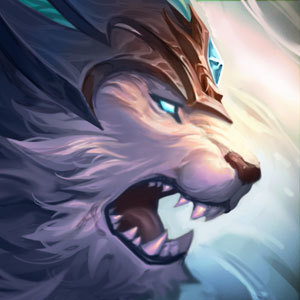
Star Guardian Icon

Hey design team at RIOT or more specifically the designers of the new Mark of the Star Guardian Icon nice job with the new skins! But I noticed something.
I'll make this quick and simple, I think the icon itself, this one here https://2.bp.blogspot.com/-EF5ac825WSM/V-GG6otXBCI/AAAAAAAAUuE/16eJDhNQJ7cir9RY4O9P0_BOWYWz5zxXACLcB/s1600/profileIcon1381.jpg
looks quite ugly, and an easy fix would be taking out the blacky purple in the background and replacing it with a different colour night sky, I made an example here using the Star Guardian page. http://i.imgur.com/wFNmZNN.png
I'm not sure how hard it would be to change it, and it's quite a small part of this big game we play but if you did end up changing it it would make my day 1000x better.