I Played A Little With Tristana's Colors

http://i.imgur.com/7cyxsSr.png[/img]

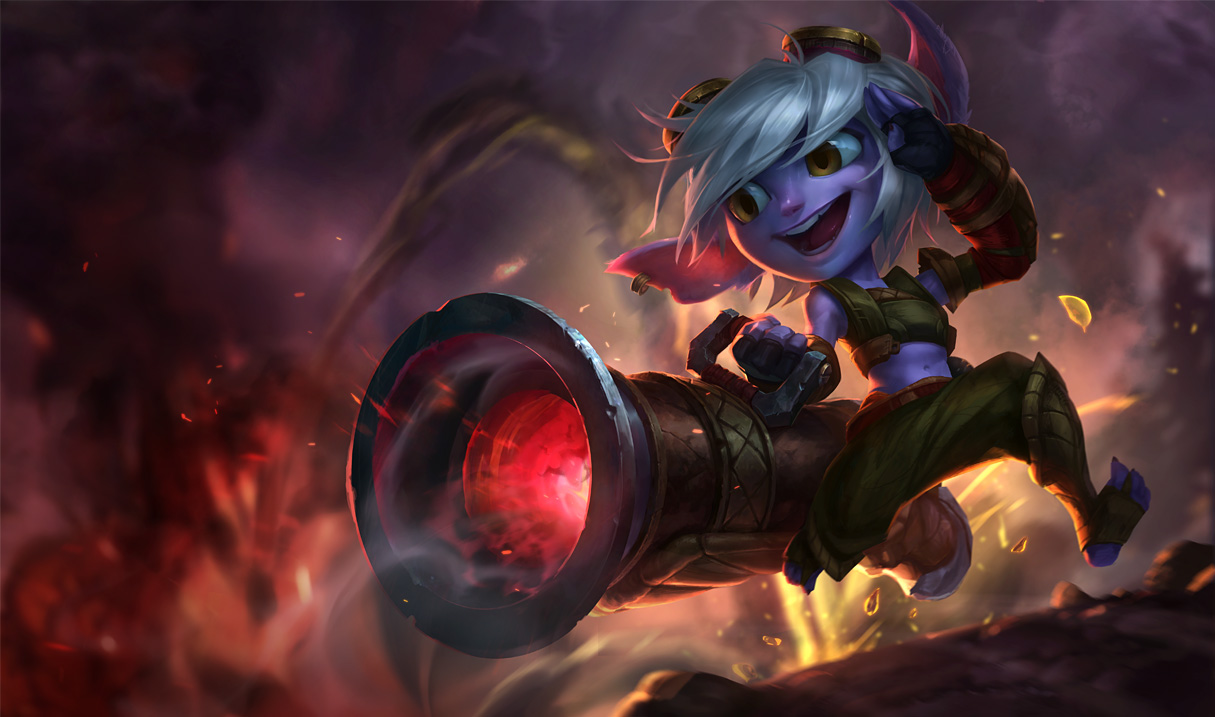
I think it looks a lot less dull like this, but her model could also look a little less . . . cartoony.
http://i.imgur.com/7cyxsSr.png[/img]
I think it looks a lot less dull like this, but her model could also look a little less . . . cartoony.
 The Soulforged16 votes
Trist looks way too cartoony now. This splash looks like the tried to add other elements to her facial structure, which I don't think were part of the yordlefication.
 myhandstypewords4 votes
I LOVE her concept art and i LOVE her new model, but this splash.... Her eyes don't look focused properly and her mouth is a bit messed up. I think she should have a slightly toothier smile, just a little. Other than that, though, I think she'd be fine. I like her pose, the way her hair moves, and her ears.
 inmUGco2 votes
Why are the splash art style is so dark it?
 OverpoweredSoap1 votes
Why are the splash art style is so dark it?
See this is the problem with this splash.
The background is so dark and warlike.
Then you have this cartoonish little animal yordle figure in the front. It just clashes too much and in certain instances it can work, but this is not one of the instances.
EDIT: The problem is the way they portrayed Trist in the splash art but not the actual model itself, as I feel if the splash was closer to the actual model it would look fine.
 Nagirah2 votes
No color modifying can fix this picture of a horrifying creature. Burn it, burn it with fire!
 Rinky Dinky1 votes
The splash doesn't even look like her new model.
 junglerboy161 votes
That alone makes it much better, however her ears, eyes, nose and mouth proportions are still off.
 Civil Dawn1 votes
The colors are better, but I honestly wish they would just redraw the whole thing. It's awfully drawn.