@Riot Ability Icon Designers and Splash Artists: Please stop.

For the past several months, you've been updating art like crazy. And to be clear, I generally love the direction of everything. New splashes are terrific, the summoner rift update is awesome, new particles are greatly appreciated, VUs and TUs and whatever we're calling them are much needed and much appreciated.
But there's two real problems. First, the new splashes, while great, are so immensely detailed and hi-res and cool that when you cut out a tiny square and shrink it down to minimap size, you can't figure out what you're looking at. For almost any of the new ones. Old champ art was a little more, for lack of a better word, cartoon-y, and that's fine, because when you got it down to a dozen pixels, the color contrast and specific palette made each champion's mini-image identifiable, for the most part.
But the new ones use so many lighting effects that colors blur together. And that looks great for splashes, even portraits, but not for the icons in-game. It looks awful. It's indecipherable. And In a game that's so gung-ho about clarity of information, keeping champ icons that are, for all intents and purposes, splashes of a random color (often not even a color related to the champion), it reeks of hypocrisy and poor design.
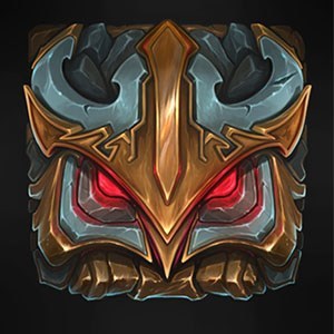
Look at Vik and Rumble:
Viktor's primary colorings are blue, gray and black. Some yellow and red highlights, maybe. That's what is on his model, that's what we expect to see when we look at the minimap.
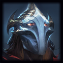 Instead? It's an orangey-blesh around a rusted metal that looks more or less bronze. In the context of the splash, it's fine. It makes sense there. But that doesn't help me in game. The champion has almost no red or orange on his body, and yet that's the color I see when I look at the minimap.
Rumble's primary colorings are blue, white and gray. That's what is on his model. That's what we expect to see when we look at the minimap.
 Instead? It's a splash of red and this pinkish hue that makes no earthly sense. Again, in the art this makes sense. In the game, it hurts.
And keep in mind, the icons here are still larger than they will be in game. Maybe zoom out a bit on your browser if you still can't see the problem. 50% should be accurate. Then look at it through your peripheral vision and see if you can decipher in a moment who it's supposed to be.
If it takes even a tenth of a second to decipher what I'm looking at and which champion it corresponds to, using only my peripheral vision, it is a problem.
Which brings me to my next point:
Can you just fire whoever does the new ability icons? Every time I see icons get updated, they get turned into.. well. It's looks like they choose two colors and throw them into 4 different tie-die patterns. I'm not a bad player. I map the skills to the keys internally, not to their pictures. I don't even typically look at abilities to know what's off cd (barring ulti). Still though, look at Karthus. I'm glad we got rid of the neon-rave lights, but now all of his ability icons are just that same green-teal-mesh that you use on everybody now. Considering his abilities are all vastly different things, it's odd to me that if I showed you his new Wall of Pain and said it was Defile, you'd probably believe me.
The new Singed one is fairly problematic. For the abilities that aren't blatantly green (read: all but 1 of them), you add green aura around them, to the point where the actual picture is drowned out by green. Empowered Bulwark scales with Mana and provides Health. Mana is blue, Health is Red. Why is there a radiating green aura around the shield in the picture?
And Maokai.. Well he's the reason I'm here right now, actually posting this. I think Sapling toss has a strong enough coloring to stand out (though that might change once I see these in game), but the rest... It's a slurry of that same neon teal you use for everything Shadow Isles. I see what they're supposed to be, but still.
Diversity between champions is important, and Riot has noticeably, definitively been striving toward that. However, diversity within champions is significant as well. You want your champions to feel like they have a toolbox of abilities that reflect who they are as a character. Not as though they have one skill or one direction or one rotation of abilities. If you've decided that a champion is teal and brown, that's fine. But everything he does and everything he is doesn't have to be teal and brown. You can add other colors. Please add other colors.
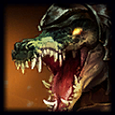 , use it somehow.
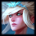 with
with  on the minimap.
 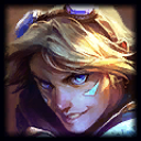 and
and  look similar now.
 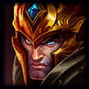 shows more of his helmet than anything.
  is this dark smear with tiny bits of yellow.
  reminds me of
  .
.
 , Singed
  , and Veigar

 =
=