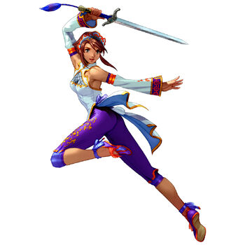
Soaring Sword Fiora color scheme

estapor·9/19/2017, 11:10:18 PM·65 votes·8,675 views
Imgur: The most awesome images on the Internet

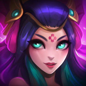
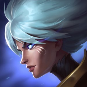
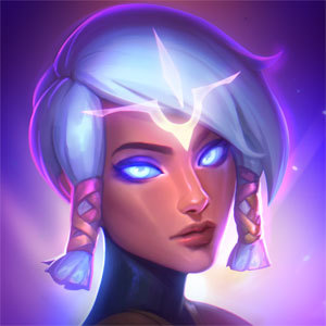
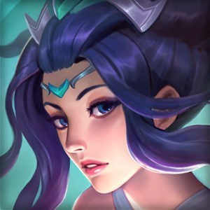
i really love this splash art, but imo the colors dont match is her hair blue or purple? also the cloth material in the art gives you a sense that it's light like silk but the blue clothing around her thighs looks thicker almost like a robe.

do you think that riot should adjust her ingame model to match her icon and art or the other way around? or not change anything at all XD?

24 Comments

Poop Jelly9/20/2017, 12:33:31 AM19 votes

I agree with you the color seems a bit off.

On an unrelated note, Fiora's splash art really reminds me of Korra :o

Riot Stellari9/21/2017, 1:26:31 AM15 votes

Hey guys, thanks for the feedback. We're going to look into addressing this so things are a little more cohesive.

gubigubi9/20/2017, 5:00:34 AM15 votes

I think they need to change the ingame model to match the icon and splash. The in game model is so much more baggy and differently colored than the splash.

Felaze9/20/2017, 5:18:29 AM11 votes

I agree. Honestly I think they should have held off on revealing these skins until everything was more ready, because Fiora's differences are very large. There needs to be more cohesion checks between the teams so that everything matches up, because both the Fiora and Janna icons don't match the splash arts very well. This has also happened before with Conquerer Karma and her icon- they look so different that the icon doesn't even really look much like Karma at all!

It's disappointing because League is such an amazing game, and the creators behind the scenes are just phenomenal, but there are some problems I've been noticing as of late when it comes to skin quality, and it's concerning. I just think that overall, the teams should be checking in with one another more frequently to make sure that everything matches, and creates a cohesive story, rather than having one thing portray the character one way while another thing portrays them a different way (I.E.: icons and splashes, or splashes and models).

TricolorStar9/20/2017, 6:23:40 AM6 votes

I want them to adjust the colors if only for the fact that Winter Wonder Karma has a huge difference between her splash and in-game model and it's really off putting

Ex. Her model has gloves, splash doesn't, splash has tattoos and no leg warmers, model has no tattoos and leg warmers

Dr Poro9/20/2017, 11:26:11 AM5 votes

I agree. Purple hair and more transparant robes, or just less robes. It looks like she has an additional layer of clothes ingame.

XIII Vanitas9/20/2017, 9:02:13 AM4 votes

I think they should keep the colour scheme of her splash art, since it looks way better.

SpookyNeedle9/20/2017, 4:22:54 AM3 votes

Model to match splash

Valor Bot9/20/2017, 3:08:05 AM3 votes

I think they should align the colors between the splash/icon and the in game model, or perhaps merge the two by creating an ombre/gradient effect of purple and blue.

Also, I realize it's probably a bit too late for this but I would have really liked if the loose ribbons of clothing on Fiora's outfit were semitransparent like in the Master Yi skin.

yay nibbers9/20/2017, 4:25:32 AM3 votes

Now that I look at them side-by-side, the in-game model doesn't really look like the splash art at all. She's practically wearing an entirely different robe, not to mention the gauntlets look nothing like what they do in the splash. I love how she looks in the splash but always thought there was too much on the in-game model.

Awoof9/20/2017, 1:55:52 PM2 votes

Ever looked at Soraka?

But they definitely should make them match.

Nielarken9/20/2017, 1:35:32 PM2 votes

Good thing im color blind because I cant tell the difference.