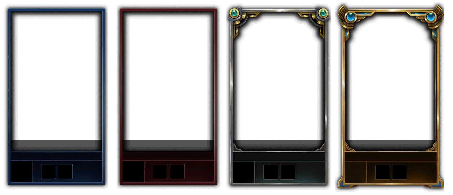
Who designed the master border? it looks so ugly

Please revert to the old one
Feedback by Makos (EUNE)
http://media.lolusercontent.com/api/embedly/1/image/resize?url=https%3A%2F%2Fboost-rankedboost.netdna-ssl.com%2Fwp-content%2Fuploads%2F2014%2F10%2Fmaster-loading-screen-border.png&key=a45e967db0914c7fb472fd4381e6c85b&width=425 This is the Master tier border for season 4. It looks like challenger http://media.lolusercontent.com/api/embedly/1/image/resize?url=https%3A%2F%2Fboost-rankedboost.netdna-ssl.com%2Fwp-content%2Fuploads%2F2014%2F10%2Fchallenger-loading-screen-border.png&key=a45e967db0914c7fb472fd4381e6c85b&width=425 It makes sense, both tiers are available to a few amount of players, have no divisions, and players can exceed 100 LP in them.
This is the master tier border for this year (3rd) compared to the challenger one (4th) http://1.bp.blogspot.com/-QKtg3SSgTeo/VjhkoctEDeI/AAAAAAAAHys/wQCSbwTGKAU/s1600/brmc.jpg
We can immediately contrast the borders, the different colors always existed to differentiate the two tiers, and most importantly, the master border no longer has the extra design at the bottom, while the crystal is at the corner instead of being displayed like the challenger one. The new one in case you haven't seen it.
http://2.bp.blogspot.com/-pzd2VdzS38c/Vjhf2NR3rII/AAAAAAAAHyA/rNkdEhGE4Bk/s640/diamond.jpg
These are the diamond borders division by division. Notice anything? It looks like master with different colors. Maybe looks better as well. But why is Master tier portrayed similar to Diamond, when instead it should be similar to Challenger due to its actual similarities?
I think you get my point, the border doesn't look epic enough, and for a 0.06% of the top players its compared to another that represents the top 2.5%, while challenger is the top 0.02%. Mathematically, the difference between 0.06 and 0.02 is smaller than the one in 0.06 and 2.50.
Compared to master it looks like something that's rewarded for better players. Its shinier, and has less black background.
To summarize, master tier rewards feel pretty underwhelming compared to last season. Master tier is a tier comparable to Challenger by all means, when the rewards for this season are comparable with Diamond (specifically the border), and even bronze, when speaking about the icon. I have by no means anything against Riot, but I feel like they need a redesign as they bring no justice to the top players. I'm speaking for the entirety of the Master Tier playerbase, and I hope that we agree on the fact that they are worse than last season's.