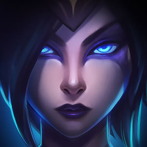
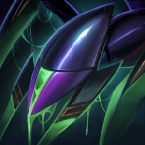
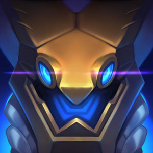
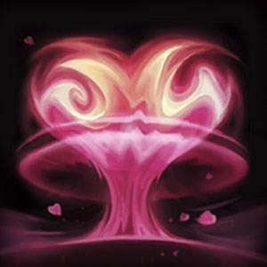
I think it is whats wrong with the new hero icons and default skins.
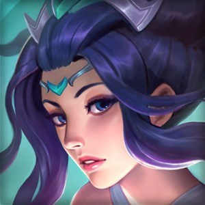
4.19 patch's hero icons and default skins are so speechless for me. I was really glad that riot are constantly improving the look of the game , but this time it is causing problem. I think it ended up going to the wrong direction.
reasons:
-
- unrecognizible:
-
I can no longer identify many champions because they cutted off many parts of their body or face. -
I had a hard time to see what those characters actually are just by their facial feature. -
examples: 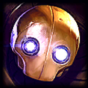
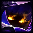
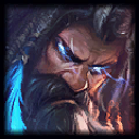
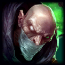
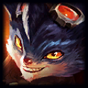
-
- out of character:
-
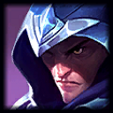
Looks like the new design do not attach to the story anymore and do not have love in it. -
They are unlikely having the charateristic the hero should have. -
examples: 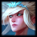
-
- problem with choice of color:
-
this is the main problem. -
The colors is too vibrant to see. -
The color theme do not match to the origanl design, which is counter intuitive too many old fans such as me. -
The colors do not reflect the characteristic of the heros, I do not see their personality anymore. -
I like the monochromatic color design it used to have because it has clairity to it, right now it is just too messy examples: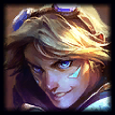
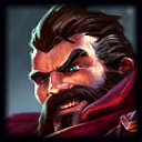
I know you guys put a lot of effort for many hero on this patch, but honestly I think its not making it better, it looks worse than before. I hope you would consider what I am saying. Lol is always my favourite game, I do not want it going to the wrong art direction, and that why I break silence this time.
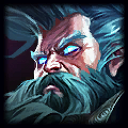
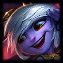
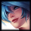
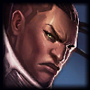
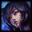
better icons examples:
I think these are much better because they are recongnizible, in-character, and using apropriate color scheme

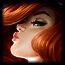
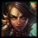
I would discuss the problem with these icons in detail if you would like to know what I am saying. Please take a look at this post. I think the look of the game is as important as the content, it is very very urgent.