Rito pls: Do not change Divine Soraka's splash art.

Laughing Fish·4/6/2016, 1:34:27 PM·17 votes·3,983 views

Divine Soraka has always had one of my favorite splash arts in the game. The painting style adds class and sophistication to the splash, and really sells Soraka's purity. Soraka is depicted as something greater than the world she is in, a glorious and beautiful entity that is gracing us with her presence. But she isn't on a throne like a monarch, she is simply sitting in a forest playing her music. She is almost a natural occurrence, a part of nature beyond our comprehension. The entire scene is so surreal, and has a frail elegance to it that feel like it could be disturbed at the drop of a pen. It is almsot like seeing a deer in the wild, and being captivated by its beauty.

Original: http://img3.leaguecraft.com/lol-splash-art/asset/wallpaper_760px_3872.jpg

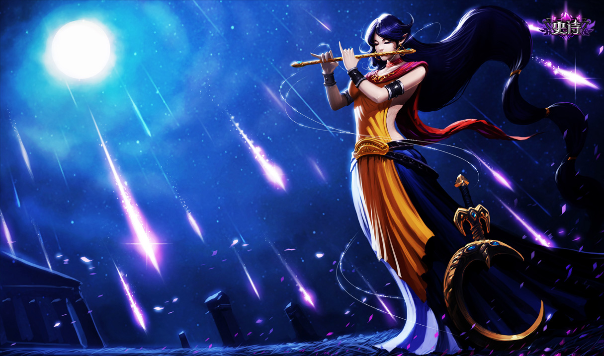
New: http://2.bp.blogspot.com/-kDYR6VRcx98/UMAJbUImOXI/AAAAAAAAD9w/kV28qD-dlqQ/s1600/Divine-Soraka-Chinese.jpg

The new one is certainly beautiful, don't get me wrong. But it lacks the elegance of the original. Soraka is still portrayed as more beautiful than our world, but she isn't really portrayed as better. Soraka is a benevolent spirit that is attempting to lead mankind to a kinder future, and the new splash art just doesn't convey that as well. She is strong and beautiful, but has lost the unique element of simultaneously being a part of nature, while being better than nature itself.

Your thoughts? Please post a comment below!

22 Comments

Ichabod Kong4/6/2016, 7:44:09 PM5 votes

Don't know if serious or memeing discretely.

ImmortalBloodCY4/6/2016, 5:47:42 PM3 votes

Original Divine Soraka Splash Art is alot more elegant and it gives a very calm and great feeling.

New one doesnt give anything .

SKOBODO4/6/2016, 7:09:16 PM3 votes

The original is one of the best splash arts in the game. The new one is such a downgrade.

Aeszarck4/6/2016, 7:53:59 PM2 votes

I feel like some of this rejection is because we feel connected to the old splashes--they hold special places in our hearts. We all get connected to certain splashes, and them going away hurts our feelings; we've lost something precious to us. However...

Imagine if we had the Chinese Divine Soraka in the first place, and we were swapping to the World one. There would be complaints: "She's so much prettier," "It's so much easier to see her," "The scene is so much more dynamic," etc. People would have gotten connected to that one, and there might have even been threads made asking to stop the change.

Just throwing that out there.

(Not saying which one I voted for though.)

Trynd Only Sorry4/6/2016, 2:06:32 PM2 votes

I actually agree. The NA splash art is much better and is what first drew me to divine soraka. It's my favorite soraka skin, and the only one i own (on a different account, got lucky with hextech XD).

disregardable4/6/2016, 1:40:44 PM2 votes

It's one of the closer splash arts to the original one. I still prefer the old one of course, but it could be worse.

YordlePwnography4/24/2016, 8:57:34 PM1 votes

Why.... T.T... the splash art doesn't even have her tattoos... I hate the new one. It's worse then menstruation.

James Winter5/16/2016, 7:13:11 PM1 votes

I agree 100% the original splash art fits her better. ^-^

Bodkins Odds4/6/2016, 3:56:38 PM1 votes

I don't know why you're bothering. The global splash art team doesn't give a damn what looks better, they just use the splashes Tencent tells them to.

Gesterr4/6/2016, 4:25:45 PM1 votes

Great, first Akali and now this, don't worry sideboob, Riot might not but I still love you!

kDrakari4/6/2016, 7:27:19 PM1 votes

The original is better than the replacement, but it's not SO much better to the same level as Nightraven Fiora so I doubt it will be changed.

Sunnyvu4/6/2016, 9:05:54 PM1 votes

The new one isn't a good fit in general. The style won't fit with the other splash art. Anime is fine but the semi-realism in all the other splash art are just so much better. Why Riot thinks this anime phase is fine.. Idk. Hopefully they wont change it.

Gretch4/7/2016, 1:21:03 AM1 votes

It seems a common recurring theme among a lot of the new splash arts is a loss of care and attention to detail. Soraka's tattoos, soft light that draws focus without drawing attention to itself, that kinda thing, it seems lost on the new one. This particular example isn't great, but a lot of the new splashes seem like rushed anime-ish drawings that lack character and uniqueness that make skins stand out. (See Goth Annie, Commando Garen, Zombie Ryze, Cottontail Teemo to an extent, Renegade Talon, Vlad's skins, the cooking Morg skin etc.)