The best solution to the minimap portrait outcry - Image included
You've probably heard a lot of "(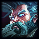
 etc)'s minimap icon looks (awful, too dark, too bright, too similar, etc.)"
http://i.imgur.com/DUczI40.png?1 (click to englarge)
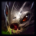
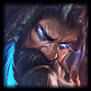
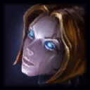
Here is what dota 2 has been doing and it solves pretty much every complaint. Each portrait is distinguishable, share a similar art style and orientation, and look good overall.
Am I crossing the line here? Is this not doable?
I'm sure this has been suggested before, but as far as I know, nobody has done a side-by-side comparison of the two.
x-posted from /r/LeagueofLegends
edited for clarity