Why is Aatrox only two colors?

RedPannda·6/18/2018, 1:20:54 AM·4 votes·3,570 views

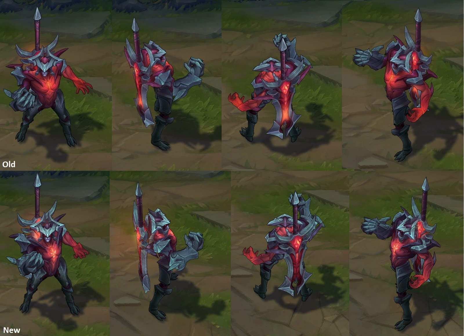
I get that you need some level of clarity so champions stand out in the heat of battle but Aatrox's skin feels like it comes straight out of 2005. He legit looks like he could have been one of the first champions designed. It is just matte grey and red. There is very little texture to even make it stand out, it's just flat angles, almost no bumps or curves. I dunno maybe I just don't get it but this feels like a massive visual downgrade from what we already had.

I just rewatched the trailer to be sure and I feel even more sure of it, he reminds me of what happens when I turn all my graphics settings down to low in wow. It looks like a low resolution trash mob in a dungeon.

It stands out to me because the rest of his rework looks so good, his abilities are flashy and his voice acting is top notch. It feels like they either ran out of time or budget before the art department had a chance to finish their job. I really hope riot considers giving him a second coating of paint to make his character not look so bland.


6 Comments

GreenLore6/18/2018, 7:38:20 AM2 votes

The reason for this is likely game clarity.

You have to keep in mind how the model looks when it is moving and the camera is zoomed out quite a bit and too many colors will make the model look cluttered.

Also its not really like he has less colors than his previous model. Old Aatrox had a grey right arm(with a slightly purple hand),dark grey legs,a pale face, a dark purple torso and bright red wings. New Aatrox has a grey right arm(with a purple palm),dark grey legs,a pale face,a bright red torso and during his ult dark purple wings(he also has some more purple colors on his back).

Steel Lady6/18/2018, 12:23:19 PM2 votes

Not everyone can be as pretty as you, Zoe. [slayer-jinx-unamused]

YuGiHo6/18/2018, 1:32:44 AM1 votes

It feels like the went overkill when it came to simplifying his design. I saw his mecha skin and its just some dark blue action figure looking thing with no clear details.

the pirate skin may be the worst though, i cant make out any of his features in that skin especially when he ults.

CamilleRule346/18/2018, 2:00:02 AM1 votes

I feel that his color might be a bit too similar to Rhaast which could be an issue, hopefully his size and general shilouette would help.

If i were designing the champion, I would have a blue color coming from the heart, bright in the center fading out into soft blue veins, to maybe imply that there's still a person in there? idk. That'd help with the focus issue right if you had some sharp value/hue contrast.

Arakadia6/18/2018, 6:40:26 AM1 votes

Perhaps they should have incorporated a little white and purple but it was to fix the clarity issues old Aatrox faced.