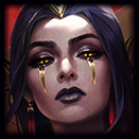
Elderwood LeBlanc: Hit or Miss???

plastic·3/3/2016, 12:12:38 AM·6 votes·4,893 views
http://imgur.com/NzSmv17

As a LeBlanc main I was honestly too excited for this skin to come out and I fell in love with it upon release. That was until I saw the splash art compared to the in game model. To me this color scheme doesn't fit LB at all, and I've been reading online and noticed many other people in the league community can agree with me on this; it looks like LeBlanc is in a river spirit Nami cosplay. Either way I shouldn't be complaining since this is my main, but when every Kha'Zix main complained about his Deathblossom colors in evolution form Riot took notice real quick and swapped some colors out. All I'm asking for is some support on this to make Riot notice that the splash and in game look like two COMPLETELY different skins and champion overall. Take a look.

http://i.imgur.com/NzSmv17.jpg) http://imgur.com/aYdEk2a.jpg) http://imgur.com/zlwqaQl.jpg)

Looks can be deceiving. Leblanc

16 Comments

Staraptor3/3/2016, 3:24:38 AM4 votes

Man, I didn't realize how different the two color schemes were. I know inconsistencies between models and splashes are expected, but they barely look alike. The splash gives off a darker vibe, more of a trickster fairy than the Easter egg colored cutesy in-game model. I mean I'll still probably pick it up whenever it goes on sale, but an edit to make it a bit darker would be pretty nice.

YCitizenSnipsY3/3/2016, 4:01:10 AM3 votes

Its got the River Spirit Nami problem. The splash and colors don't really reflect one another. Its something that I wouldn't complain to see fixed. But its a good skin and a good splash, So I'm not gonna let that stop me from buying it.

Kinjishi3/3/2016, 3:54:42 AM3 votes

Well, the wings are even designed different in the splash and in-game model. The splash looks like it is darkened quite a bit, so it's hard to tell what the actual color should be when ELB would be standing in broad daylight.

hi im minty3/3/2016, 3:51:02 AM2 votes

Also the head thing looks like a butterfly in the game while its leaves in the splash. Pretty different to me.

Yasmin3/3/2016, 12:52:07 AM2 votes

I couldn't agree more. At first glance of the splash art the skin seems like something I would buy, but the in game looks like the color scheme was copy-pasted from River Spirit Nami (a skin I dislike for it's too bright of color scheme and strange aura overall). I would much prefer the in game color scheme match that of the splash, but then again I'm not a Riot employee and lately it seems they are going for a more cartoon-esque theme for their champions/skins. Hopefully something will be done! [slayer-jinx-catface]

BLU Medic3/3/2016, 12:06:09 PM2 votes

Honestly, if they just darkened the in-game model a bit, it would look way better.

Valor Bot3/3/2016, 4:55:47 AM2 votes

The splash art has a primarily green color scheme to it, whereas the skin itself seems mostly pink. I'd like the skin more if it were a bit darker to match the shadowy colors of her splash, but that's just my personal preference. I agree that the bright, pastel colors don't seem to suit LeBlanc's sinister personality.

The Whamboozler3/3/2016, 12:21:20 PM2 votes

Just goes to show you how little the different divisions at Riot communicate with each other. Someone got a memo saying to draw "Faerie LeBlanc" and they did... while the skins team got the same memo and they did... then they saw that they two didn't match and said "screw it, just put it out there. Those stupid monkeys won't even care.".

The Pale Woman3/6/2016, 8:25:17 AM2 votes

Her colors should be darkened, I agree.

Reaganomics3/10/2016, 9:01:32 PM1 votes

On another aside, I do agree with you about the colors btw, I really wish it had the flutter animation when she reached 425 MS instead of her normal walk. They put so much effort into the flutter and you can barely see it when she dashes. Would be such a good change.

Valaran Nara3/3/2016, 12:51:22 AM1 votes

The difference I see is that the model has a glow to it. Which is the only thing. They look identical to each other. Just one is slightly brighter. And then the not so bright splash is under some shade from the canopy above.

Sukishoo3/3/2016, 4:45:32 AM1 votes

Most of it is the same color, she's just in shadows in the splash

iTzz Sunara3/8/2016, 4:02:59 PM1 votes

I really dislike the River Spirit Nami Splash as well as the ingame model. The colors are much too extreme, which makes the skin look.. hard to describe.. colorless/bleached although it's so many-colored. It's exactly the same with Elderwood LeBlanc's ingame model. While the splash looks quite beautiful, the model doesn't do it any justice. Not to speak of the fact that the theme doesn't match LeBlanc at all.

Bottom line, I wouldn't spend any RP on this piece. If Ravenborn is a 9, then Elderwood is like.. a 2.5 or something.

Moonboy653/3/2016, 12:23:28 AM1 votes

splash arts are supposed to be like that...