Ahri Splash Art tweaks
Aria Storm·10/14/2014, 7:42:33 PM·57 votes·20,801 views

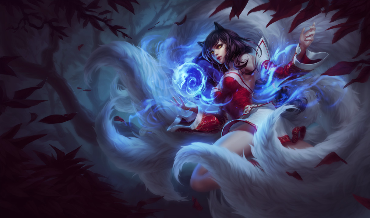
I kinda liked the splash art and at the same time I didn't. Saw a lot of people didn't like it that much so I tried to tweak it in ways that would fix some of the things people had problems with.

Original: http://2.bp.blogspot.com/-SVAAVXUMURo/VDwpN4GPLvI/AAAAAAAAbJw/zq1fLshfmrU/s1600/Ahri_Splash_0.jpg

Original Lightness with Face tweaks: http://i.imgur.com/ID9m1qV.png

Tweaked lightness: http://i.imgur.com/kSUpc4c.png

Tweaked Lightness v2 and edits to mouth: http://i.imgur.com/gzXkUNd.png

So some of the changes I made: I changed her eye shape, trying to go for a more foxy look. Made them more vibrant as well as making the pupils more noticeable. I changed the mouth slightly, made the teeth more visible and made her smirk a bit more. Also changed the eyebrows slightly, adding a small bit of furrow to make it look like a trickster smirk. The whiskers were always there, just really hard to see. So I darkened them. I lightened up the splash art as a whole as well as made it more vibrant and taking away a lot of the blue - making it more green instead like the old splash. I did this because it was too dark, too blue and looked too much like a harrowing splash art.

Hengtai's Edit: http://i.imgur.com/BfgMlXB.jpg

Hengtai edit 2: http://i.imgur.com/ytl3nLkh.jpg

What I did:

  • Added more baby fat on Ahri's face
  • Increased the emphasis on the eyes
  • Thinned her hair out so it's not as poofy -- Lowered and reshaped the mouth
  • Recolored the lips so there's not as an intense color

Tweaked v3 Normal Lightness: http://i.imgur.com/PSPdPkh.png

Tweaked v3 Edited Lightness: http://i.imgur.com/z1roiWG.png

Changes I made: I took Lyrith's face/hands edit and combined it with my own. (Eyes, mouth) I changed her hair, making it taller/less flat headed and less poofy. (Taken from Hengtai's edit) I made her ears wider/slightly taller + added the inner ear fluff (inspired from Hengtai) I attempted to paint in the bell - my painting skills (from scratch) aren't that great but I really tried to make it look like it fits in. (I took Hengtai's bell edit and coloured it in/tweaked it, basically.

V3 Tweaks + Hengtai's face http://i.imgur.com/DSphzxXh.jpg

In short, this is basically a mash up between three tweaks in one. :)

I was thinking about tweaking some other splashes, we'll see!

Thoughts? Better? Worse?

Edit: Added one with original lightness.

Edit: Added a third edit with @MrBuffington suggestions.

Edit: Added @HengTai edit as requested

115 Comments

HuskerWolf8210/14/2014, 9:52:11 PM7 votes

There is no amount of tweaking that can be done to fix this picture. The ears are just so wrong, she has absolutely no Asian features, her tails lost their silky look and instead look like what belongs on a dust-mop, she looks more innocent high school girl than a grown woman that seduces men (as her lore says), her clothes grossly emphasize her breasts too much ("less revealing is more alluring") compared to the original, the environment is too dark for a champion described as cunning and curious. No matter how you try to tweak or spin this splash, it just isn't Ahri. Even the artist concept of Ahri for New Dawn did so much better: here. I appreciate the artist's effort by itself, but Riot really dropped the ball on this one with one of it's most recognizable champions. They need to start from scratch with a new splash and not use this one.

ChaosThief10/14/2014, 7:56:36 PM6 votes

It looks more like the original, for sure, and people liked the original better from what I see. Personally I just like anything new in art even when everyone hates it.

Just so we're clear: Looks better and more like the original.

Wînter Fox10/14/2014, 8:54:42 PM5 votes

Definitely better, good job OP. I still don't like the overall pose and her face shape/angle, but at least yours doesn't make me want to boycott LoL

Squeaky Dreemurr10/14/2014, 8:08:38 PM5 votes

A significant improvement.

Le Cheesie10/14/2014, 8:51:35 PM3 votes

I like the tweaks to her eyes/eyebrows/mouth, but I don't like the lighting at all. The dark coloring on the original with the face tweaks you did would be pretty amazing, though.

Ahris10/14/2014, 8:21:43 PM3 votes

i dont like the tweak. The dark feeling is what kind of defines ahri. That new tweaked on changes a lot and i dont like :(

Conncept10/14/2014, 8:41:18 PM3 votes

How is totally destroying the dynamic natural lighting of the piece in favor of what looks like low-budget office lighting a fix?

HengTai10/14/2014, 11:38:46 PM3 votes

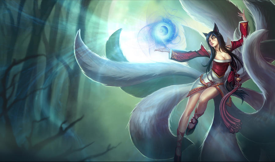
I like those tweets quite a bit, but I still feel like something's not quite right (in terms of facial structure). If you look at Ahri's current splash art, you can tell that her face is actually both taller and broader than the new one. The new splash, while it aims for a cuter and smaller look, ultimately doesn't make it look like the same person. Janna's splash art also suffers this but to a greater degree (she has a different body and facial structure in which she's too vertical and skinny : like a twig). Not to mention, I don't really know why Riot is trying to take an approach at making Ahri look less oriental. There's nothing wrong with trying to include every ethnicity, but trying to change facial patterns for a different look simply makes a champion feel alienating to a player base. For example, if you look at any of Ahri's other skins then compare it to her new classic, it doesn't feel like the same champion. It would be the equivalent of trying to make a champion like xin zhao or Lucian have extremely "generic" facial features so that you could more or less not tell what specific ethnicity that individual is (for example, more beige skin, a generic eye structure, etc). Oh yeah, I think Ahri's splash might also look a tad better if you tried to make her lip color the same "beige" look as in her original splash art.

http://fc09.deviantart.net/fs70/i/2012/255/b/7/ahri_splash_art_by_aveldine-d5ej1ds.jpg

Those ethnic quirks and details in a champion are really what define the familiarity in identifying with said champion. For instance, when Vladimir came put with his new splash art a year and a half ago, it was extremely well done because of the same feel it held to the original. It ultimately did it justice and even glorified what Vladimir "felt" like and was welcomed by the vast majority of the community with open arms. While I feel like the newest array of splashes have done extremely well in doing so (such as Akali's newest splash art) I feel like some of the champions have lost a sense of familiarity to them with their new defaults such as Lee Sin, Ahri, And Janna.

For example, in this fan art of Ahri and Janna (done by Artgerm [Stanley Lau] who did Leblanc's splash art and the Yasuo sneak preview arts), I feel like he really captures the champions really well not just in terms of their themes, but most impressively the facial struture of different champions that suit the individual very well:

http://artgerm.deviantart.com/art/Foxy-Ahri-399325683

http://artgerm.deviantart.com/art/Janna-Poster-Art-407610100

Don't get me wrong. From an aesthetic point of view, the artists at Riot have done a phenomenal job (as with every splash art they release); however, I do feel like I'm not alone when I say that with the newest set of the splashes, I'm not the only individual who feels like some of the neweset splashes don't capture the "feel" of a familiar champion (because if they did, I don't think there would be so many people adusting the newest splashes on Lee Sin, Ahri, Etc.)

Justaco10/16/2014, 3:59:32 AM2 votes

When I saw the new Ahri splash I felt the face just felt like it wasn't quite working. These edits really go a long way to making the splash looking how it should. The other problem I had with this splash (and several others) was how dark and colorless it was, and the lighting changes fixed that well too. Keep up the good work!

MrBuffington10/14/2014, 10:57:28 PM2 votes

The more I've been looking at the PBE splash over the day or two it's been out, the more I've come to like it, but boy I still think your changes are a huge improvement (but I might be biased since you also address most of what I was complaining about across various threads :P). What I think is most impressive, though, is how professional this looks; many of the community changes to art I see have some evidence of modification; I wouldn't be able to tell with your work if I didn't have the side-by-side comparison

I want to state that I do think that your version is a vast improvement over the PBE version, however if I were to nit-pick at three things (feel free to criticize my criticism, it's super nit-picky and I don't want you to get the idea that I don't think your work is amazing. I'd also like to hear your thoughts since I'm no artist):

  1. The initial changes you made to the eyes stuck me as somewhat sinister looking upon first glance. I think the color changes you made in your second version do a lot to curb this. I know that the original splash (as well as the original PBE splash) has her with yellow eyes, but I'm wondering what she would look like if she had different color eyes, like the blueish eyes she had in the "A New Dawn" cinematic (link below), or even a bit more subdued/less striking as it is in the PBE splash (there are darker shadows near the tops of her iris and more eye makeup/darker lines around the iris, where there is a bright yellow/gold throughout the iris in your version with thinner lashes)
  2. This is also pretty minor, but because of the changes to her eyes, you can already see the smile in her eyes without needing as much of a smirk, as a result her smile seems a bit stretched. I'm wondering what she would look like if her smirk was pushed back a bit inbetween where you have it now and the original version
  3. Another minor thing, I'm no artist, but I think if you could maintain some of the original splash's cooler scheme, specifically on the leftmost side, and transition to the warmer scheme, it might have a greater effect of drawing the viewer towards Ahri. Basically, in addition to (from left to right) shifting from darker to lighter, it also shifts from cooler colors to warmer colors.

A New Dawn: https://www.youtube.com/watch?v=vzHrjOMfHPY

If you have the time I'd really like to see what you could do for Janna and Wukong (those are the other two that feel a bit off to me)

Great work!

UPfreely10/15/2014, 2:19:19 AM2 votes

I'm sorry but I don't like your tweaks at all. You kind of demonized her eyes and made them seem full of emotion - something misplaced in her lore. She may be an 'evil' soul sucker but she doesn't do it for the pleasure. I like the darker backround too as it represents the life in which she lives.

I can appreciate the attachment to the old skin you all have, especially her ethnicity but I feel the new one matches her lore better and is a healthy adjustment for the future of her character.

HengTai10/15/2014, 3:32:45 PM2 votes

Here's a version with an outline of her bell thing:

http://i.imgur.com/ytl3nLkh.jpg

Aspynn10/15/2014, 12:01:35 AM1 votes

I really like the lighter versions that you did! Her tail looks more white in those, where as in the original it looks almost grey... But honestly I just don't like face before or after your editing lol... It just doesn't look as good as the current splash art imo D:

HengTai10/15/2014, 10:16:50 PM1 votes

I like the face of my version tho ><

iMaB3AST10/15/2014, 11:06:50 PM1 votes

Your really good at editing/tweaking the splash arts, u should work for riot :D

Gunpoint10/16/2014, 12:07:49 AM1 votes

Hentagi's original edit was the best. But this is what happens when people complain about League over sexualizing the female champions. They get splash arts that are all in the same position, as if they are trying to hide their boobs like it's a game on abcmouse. Literally all off the female splash arts this round are in the same position, check Ahri's, Janna's, and Kayle's.

JustBoneBrook10/16/2014, 12:39:41 AM1 votes

Well Tweaked lightness: look more like the old one but i dont think it better than the original one: #1 it look more green #2 the light was coming from the orb and was not the right color green white vs a orb BLUE i dont see why it should be like that

weihe12310/16/2014, 2:16:36 AM1 votes

[deleted]

Jamnon10/15/2014, 4:32:42 AM1 votes

I really like your tweaks: my only peave is her face isn't asian enough, seeing as how the mythos of the kitsune comes from korea/japan