10 Comments

DrCyanide10/15/2014, 9:18:53 PM4 votes

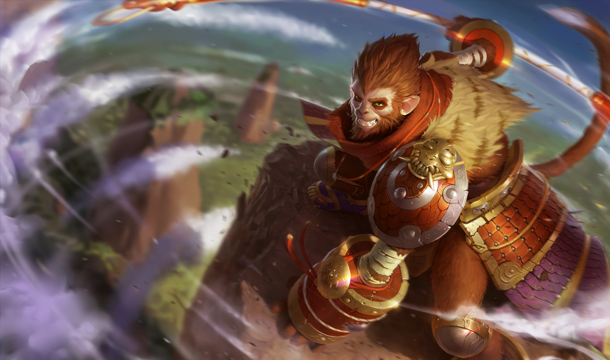
Honestly, I'd like the newer one better if it didn't look like he was growling at me. In the original he's got this smirk on his face that seems tied to his skills/ stealth/ whatever. The growling face just doesn't look like it fits for Wukong.

Solidair310/16/2014, 3:18:18 AM3 votes

I love the smirk in his new art (more than the old) and I also just like the style a lot. Very cool!

ShadowGlaive21310/16/2014, 1:57:53 AM3 votes

New Wu looks gruff and bulkier like he's looking for a brawl. Definitely prefer the original sly monkey.

Mistiya10/16/2014, 8:51:43 PM2 votes

I really like the pose in the new art but the colors are off. Darken his fur to match his in game model and maybe... something with the expression? I don't know it just doesn't look like wukong. It's hard to say the old art is better, but the old art looked more like wukong.

Kinjishi10/15/2014, 10:19:42 PM2 votes

Like the original better. It presents him as more of an honorable fighter. With new wall, it loses that and he just seems more ill-natured.

junglerboy1610/16/2014, 6:38:30 PM2 votes

I think the new one is done better, all they need to do to make it perfect is darken his hair. Right now it is too red/orange, if it were darker like the old one I would definitely love it 100%.

Greedalox10/16/2014, 7:12:14 PM2 votes

I prefer the new one. I feel he is grinning, almost as if he's mid dodge or just dodged something and in the moment he's smiling to himself. Maybe darken his fur a bit, but that's my only complaint.

JustBoneBrook10/15/2014, 11:43:26 PM1 votes

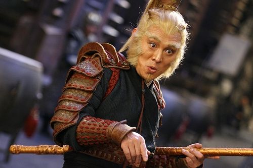
the too got good point the frist look more serius the other one look more tricky. like in this: http://images2.wikia.nocookie.net/__cb20100428173228/mythology/images/6/61/Sun_wukong.jpg