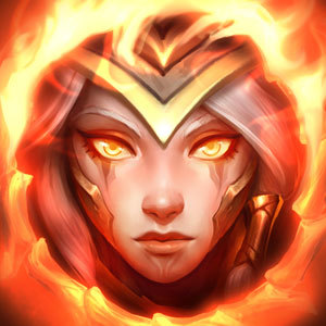
Tl;dr So the new champion profiles

So I've been thinking this, recent champions have better quality splash arts that are like super detailed looking. But compared to older champion default skins splash art, the colors are much duller and not as bright and "pop" in general.
Older default splash really pop with the color choices, vibrant colors that give a lot of personality. Ex: Blitzcrank, Ashe, Riven
The new champion splashes have overall dullllllller colors like cool greys and cool colors, which doesn't really "pop" and the character just blends in instead of standing out and showing personality. I know this might be really nitpicky, but the splash looks flat, cuz the colors are flatter, even thought the details are clearly amazing. Examples: Ivern, Camile, Kayn, (updated champions) Warwick and Yorick.
Sort of like movies lacking real black in color balancing. Losing a bit of contrast because the darker theme that cover the character, even Ivern a happy guy looks a bit dull instead of the sunny happiness like his Candy skin.
I really just thought about this after like scrolling through champion profiles, and seeing that for the newer champion profiles look so dark that I couldn't tell who they were while on my phone, while other older profiles I could clearly tell. So idk what other ppl think about this, maybe I'm just being extremely biased towards old splashes.
Note: Oh and since I'm on my phone idk how to add images. This would've been much easier to explain lol.