Riot, New Aatrox is a Big Downgrade

Riot, listen.
Every single time you have reworked a champion, it's resulted in a significant improvement. But, this seems to have changed with Aatrox.
I've really tried to like the new Aatrox, and to somehow make sense of your changes to him. But, I'm just confused.
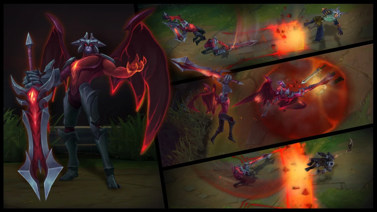
Visually, the old Aatrox model is far more detailed, with a great tonal balance and a distinctive silhouette. The murky color palette and array of spikes that punctuate his outline make him look sinister and menacing. The new aatrox, on the other hand, looks like a generic beefcake with an extremely simple and overly bright color palette and hardly any variances in tone, contour or detail. The result is that his chest is just a big wall of red, and his leg armor looks like a grey pair of pants. He looks like he was created in Microsoft Paint.
Look, compare old vs new:
If I was new to this game, and you asked me to tell you which was the original and which was the rework, then without hesitation I would have chosen the original as the rework.
As for the voice-acting, it's absolutely horrendous compared to his old VO, and I wasn't even that fond of the old one. With the hammy overacting, the strong Romanian accent, and the poorly chosen word choices, he sounds like a cross between a cartoon villain and a standup comedian having an onstage meltdown fuelled by Vodka and antidepressants. Comic relief is okay, but overdoing it to the point of Christmas pantomime is not. It's jarring and it takes us out of the universe you spend your days trying to immerse us in. I just don't know what you were thinking when you decided that people would like this new VO.
I want to ask you to not go ahead with the update, to just abandon this foolish venture, and leave Aatrox as he is. But I know that's not going to happen. So instead I hope you'll take this as a learning opportunity to reflect that people's love for this game is not unconditional, and if you want it to survive in an increasingly competitive market, you're going to have to start putting more thought and effort into your work.