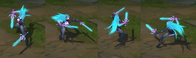
What's wrong with Deathsworn Kat and Deathsworn Zed? Why do they look so bad?

DrCyanide·10/11/2017, 6:14:59 PM·11 votes·12,416 views

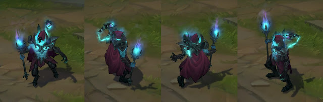
Viktor's Deathsworn skin looks amazing! There's enough glowing phantom-ish stuff going on to make it spooky, but not a distracting amount. https://1.bp.blogspot.com/-tk-vb8rILIs/Wd2JCuKjNSI/AAAAAAAAxFE/Er9diu_8uYUqTY63Q_RHndcUrb14N6GQgCLcBGAs/s640/viktorturn.jpg

Zed though? I look at his pink claws and think he messed up his Wolverine cosplay (maybe Zed's color blind, IDK). The little swords on his back remind me of Shen too. Nothing feels spooky or scary, it just looks confusing and distracting. https://4.bp.blogspot.com/-iomSPbIeob4/Wd2TZFVZMUI/AAAAAAAAxF8/CAnBf5IMin87rPZNmD6CKF6qU3g3DfqZQCLcBGAs/s640/zedturn.jpg

Kat takes Zed's problems and cranks them up to 11. When I look at the color scheme, I'm pretty positive you're just trying to recycle either a Neon Strike Kat skin or an Arcade Kat skin, maybe a Death Blossom Kat skin. https://1.bp.blogspot.com/-JqgQNeu7lLk/Wd2DG3680_I/AAAAAAAAxEE/qZ7BcCCOLGgoWdoIbo_YBO9bGolyTj58QCLcBGAs/s640/katturn.jpg

So what's going on? Why does 2/3 of a new line look terrible while 1/3 looks amazing?

19 Comments

Riotmoonstones10/12/2017, 6:44:19 PM11 votes

Hi DrCyanide -

** Why do they look so bad?**

This isn't useful for us when parsing feedback. It's absolutely okay to say you don't like something, something sucks, etc., but please tell us why. We aren't able to make changes or have a direction to move in with your feedback otherwise.

I'm happy to hear you out if you have specifics on what you don't like.

#Zed

Nothing feels spooky or scary, it just looks confusing and distracting.

What would you change to make it spooky or scary?

** I look at his pink claws and think he messed up his Wolverine cosplay (maybe Zed's color blind, IDK**

Do you dislike them as a whole, is the color the issue?

#Katarina

When I look at the color scheme, I'm pretty positive you're just trying to recycle either a Neon Strike Kat skin or an Arcade Kat skin, maybe a Death Blossom Kat skin.

We aren't, but what stands out as the larger issue - the hair, the blades? What color scheme would you suggest/tweaks would you make on the existinf color scheme?

JooshBox10/12/2017, 12:33:45 AM4 votes

Unpopular opinion but I really like Kat's skin and colour scheme probably the best of the bunch. Her hair color and movement make her look like a spectral wraith. I also like her animations the best, Viktor is second best for me and Zed fall pretty flat. Viktor's model is actually better than Kat, but the spell effects lack clarity and bring the skin down. Every ability is varying shades of the same light blue it actually looks really difficult to identify which ability is which. The Q is ok I guess a bit lackluster, the W is cool but I wish it was a different color maybe a dark purple or green. His E is fine I suppose but another light blue, which again is not bad but paired with his last ability the R it's blue on blue. His R is by far the best ability really cool sound visual and thematic 10/10. I play Viktor and Zed more than I do Kat but those are my opinions.

Variks the Loyal10/11/2017, 6:16:54 PM3 votes

I like Zed and Kat much more than Viktor's personally.

Fight me.

Forhonor32110/11/2017, 7:52:03 PM3 votes

Zed for the most part I feel can work, they just need to tweak some things like the claws to look better, cause I like the idea of that on this skin, and probably change the daggers back to shurikens. Hell, shift some of the colors around a bit maybe.

Kat on the other hand I don't feel fits at all with the look or feel of this theme. If anything I get more of, like you said, Death Blossom color scheme from her. The daggers look off, the hair, while they try to make it float, still looks a bit stiff and because she keeps her more human-like appearance it doesn't match with Zed or Viktor in this undead haunting spirit feel.

Silvarspark10/11/2017, 8:29:37 PM2 votes

I agree that Victor's skin works best. It's the colors and the contrasts between light and darks. It's really well balanced. Plus Victor's skin has great design elements to show the shadow isle inspiration.

Zed's design is alright, even the claws, but his colors are a bit wonky, like the pink and the skin overall seems much brighter than Victor's. That shouldnt be much of a problem to fix though.

Kata...yea, I agree this is rather bad. She's way too bright, the pink (again) doesnt really fit and while Zed's model is fine, you dont really have much to look at here. If you zoom in, you can see a bit of Shadow isle armor pieces, but they are very small and pretty much disappear in regular view. That leaves us seemingly with a recolored Kata with glowing hair and blades. I guess it's somewhat inspired by a banshee. The ghostly aspect from the other two skins is dropped here. She even has regular skin instead of the green spectral one.

LostFr0st10/12/2017, 7:22:27 PM1 votes

I think the Viktor one is really nice. It's sharp and even at a quick glance the skin has a good overall read. The colours and tones have good contrast and pop.

The Zed one looks strange when he's autoing. Sure, curved claws are new! great! But any animation other than when the passive is procced (slash) looks kinda awkward due to the steepness of the curve.

In addition, the colour palette is too tightly related within the skin so it tends to blend instead of popping like Viktor's does.

Possibilities to explore:

  1. I think the opening on Zed's head glow is too big, resulting in a blinding effect which mutes the contrast on the rest of the skin. Doing so would also stop the head from blending into the back as much.

As for Katarina, the spectral arm or w/e is hurting the cohesion when I look at it. So first glance the player is like "Oh, she's in costume" and then we start looking more closely and you get "Wait... what's wrong with her arm? No... but her body and face are skin... HMMM..."

Possibilities to explore:

  1. Put another tone in Kat's hair near her face to get some contrast. Bright teal beside skin tone is too hard to read.
  2. Spectral hand either need a way better read or needs to go. It looks strange since it doesn't match her chest and face. In addition, it blends in too strongly with her hair and the 'daggers' which stops the hair and 'daggers' from really popping when the overall skin is looked at.
  3. Sharpen the armor colours/contrast. Maybe just pushing the different grey tones apart like Viktor's would do it.
Nintendo 3DS10/13/2017, 6:06:53 PM1 votes

Here some ideas for both Kata and Zed that may help. (not sure if i can submit now)

Kata needs to be a bit "spookier". More etheral, more ghostlike. Maybe have her face paler, just throw in some make up ? I made a quick drawing to try make her more creepy/halloween like. If i'm allowed to share it i'd be happy to send it !

As for Zed, the most ...annoying are really his weapons. I just noticed the blades on his back are the same as Kata so i guess there is a story; but by the end, Q spell looks so goofy with a knife. Keeping the shurikens was really the best choice. Same for the claws, no idea why he has claws and it really make it awkward and clunky with his model. I know you guys said you can't change the weapons at this point, but i feel like people would really be more forgiving with these skins if he had keep his original weapons... Isn't it possible to copy and paste weapons from another skin ? :o

Then, some minor esthetic choices i noticed on Zed. Overall he could use a more ...Impressive appearence. He doesn't nearly look as threathening as a master of shadows using ghost could be. Like, he need to feel overall like that spirit coming from the undead world reading to rip you out, right ? But rn with that armor he looks like he's too poor to afford a full outfit. I think it could help a lot to just... Give him more armor. The midriff showing make absolutely no sense and looks super weird on Zed. It takes of his scary factor. So i'd say, if you guys could cover Zed a little more, especially that exposed stomach, i'd be more than thankful. Another point i noted with him is how skinny he looks, compared to usual, but also his legs...don't fit with his upper body. His legs are super frail and weak looking. I'd say, maybe bulk him up a little ? Or give him boots instead ? Just plain black knee boots could really work better than that...weird shoes + sorta black stocking ensemble. Also perhaps make his mask more covering of his "face". I don't think you could add him something majestic like a cape but one can dream :D

And finally (may works for Kata too) less blue. the blue here is too bright, so bright they look like Neon Unit and no spirits. Spirits are etheral, almost fading. I think it would gladly help to tone down the violent blue to something more soft, almost cloudy. Basically, more Kalista than Neon Strike Vi.

Just darkening the colors and toning down the brightness may be an exellent change to consider.

What i'm suggesting is super minor because i know you guys can't change really big points, but i think stuff like adding more armor can be discussed right ?

I may have spit on these skins quite a lot, but i frankly believe they can be saved (i may be biased because i'm a huge fan of Viktor and Zed and i like Kata too) so it be really sad to not change them and let them go live like this, especially since the community really has trouble accepting them to the point of wanting them scrapped :/ So i'll try to be more constructive and help a bit ! If my suggestions can make a difference.