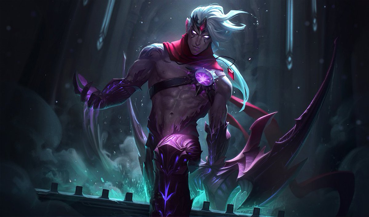
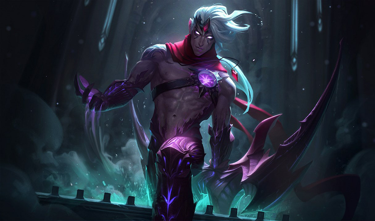
Can we talk about this new Varus splash
333lom·12/13/2017, 9:23:51 PM·39 votes·8,780 views

https://pbs.twimg.com/media/DQ8_tb_X4AEWp2K.jpg http://www.surrenderat20.net/2017/12/1213-pbe-update-varus-splash-update.html

Compared to this https://ddragon.leagueoflegends.com/cdn/img/champion/splash/Varus_0.jpg

Yes, the old splash does look more "smudged" so to say, but I came here to talk about anatomy and proportions.

I feel like his face in the new one has a too long and pointy chin, coupled with the large ears that are sticking out, they definitely don't present him as a handsome man. Also, his chest looks bloated, and the abs look like they're floating all over the place; in the old splash he did look handsome. what are your opinions? My friends all seem to agree with me.

https://cdn.discordapp.com/attachments/207732593733402624/390612944712499201/image.png

Instead of being straight, they start up too wide, and at the bottom very narrow. Was a real photo referenced? I'm pretty sure typical abs don't look this way.

https://cdn.discordapp.com/attachments/207732593733402624/390613829643665420/image.png

I'll edit the post if I find improvements to it.

First edit: Here, this is what I saw when I first looked at it https://cdn.discordapp.com/attachments/207732593733402624/390616640242450432/image.png This is what I meant with abs being too wide on top, and narrow at the bottom
63 Comments

redniwediS12/13/2017, 9:43:28 PM24 votes

The old art put a lot of focus on the bow, which would make even more sense now that he is a Darkin. Just feels odd to have the splash art focus on his new body more than the bow now.

Tesla Effect12/13/2017, 9:44:28 PM22 votes

Since he is not a human (more like an amalgam of three bodies and souls), regular human muscle structures dont apply anymore.

Placentas12/13/2017, 9:43:51 PM12 votes

Still a sexy mothafucka so I'm chill with it

junglerboy1612/14/2017, 2:40:46 AM7 votes

Actually what you're seeing in the first one is muscle development and the bottom of his ribcage. If anything, his abs are more accurate and less overly defined, since he has the proper two sets above and one set below his navel, with the one below having less definition (which is normal).

The other muscles you're seeing more of are his spinaserratus if I'm not mistaken. They're the muscles that cover the sides of your ribs connecting to your abs and look like interlaced fingers when clearly visible.

As far as torso width, Varus definitely seems to have hit up the gym more, but part of it is his particular stance, since now we're looking at him head on with a slight left hand tilt of the upper torso, which flairs the ribs creating the illusion of more mass. The old perspective looked at an angle from the side, which is one of the slimmest views of a male torso.

His head is now just tilted forward, making it appear more elongated towards the chin area and making the ears appear higher and possibly larger.

TL;DR: New Varus splash is if anything more realistic, just with different perspectives and a tiny bit more muscle mass.

EDIT: Look at pictures of the Mr. Olympia classic physique competition runner up Chris Bumstead, he's a fair bit bigger than this splash art, but you can see the same kind of musculature.

Late For Tea12/13/2017, 9:50:11 PM7 votes

I agree with your points regarding his chest and face, but a bigger issue is in my opinion the composition of the entire image. There's too much going on in the sense of body positioning. His right arm is forward, coming out of the mist. His left leg is bend forward while he's stepping out of the bath(???). Then there's his left arm, which is behind the rest of his body (making a completely opposite movement from his right arm), with his wrist bending around some unnecessary part of his bow so he can hold the grip. On top of this the entire image is tilted slightly sideways, while Varus himself isn't standing straight (because of the weight of the bow?). It's incredibly hard to get a grasp of the composition, and it makes Varus look really clunky.

In the old splash there was a clear idea of what Varus was doing: shooting his bow. His new splash is just a bunch of cool poses slapped together without any real regard.

MisoTroll12/14/2017, 5:27:18 AM7 votes

Honestly this whole varus thing is awful. Making him a darkan opened up so many cool backstory options, but instead of going with literally any of them Riot went "nah, we need to appease the SJW gods and make a gay champ". Not homophobic at all, but recreating a pre-existing character as gay has been proven NUMEROUS times to be an entirely bad idea. Same with changing race, gender, and other identity tropes.

ElectroScalar12/13/2017, 9:41:00 PM7 votes

His torso looks like a balloon in the new one xd Yea the face irks me too

Blaiz Fenix12/13/2017, 10:08:45 PM6 votes

I think the main goal was to emphasize his body as the combination of 3 people and not just a otherworldly bow-wielding figure. I do think stress was put on his features (square jaw, toned muscles, etc.) to make him seem like a beautiful creature.

Lastly, he may look a little inhuman but remember although he may have taken many part of humans, he is part Darkin. Both Aatrox and Rhaast have these weird elongated abdominal structures which may explain that reasoning.

P.S. I this is still a unreleased WiP so there may be changes

MysterQ12/13/2017, 9:41:54 PM6 votes

I think his leg looks funny. Like, Idk it is just weird.

Maratsune12/13/2017, 10:36:17 PM6 votes

I don't have too many problems with his body- I've always been trash at figuring out male anatomy anywho. His shoulders do look rather broad compared to his waist/hips though- it almost looks comical once it gets down to his demon pants, like he has tiny legs compared to these massive shoulders. He looks like the cartoon version of Superman.

ANYWAY. My personal issues are with his face. His face wasn't great to begin with in the original splash attractiveness-wise, although I always thought that he had potential. Fan art usually makes him attractive pretty effectively. I mean, make a pretty boy with a long white ponytail. It isn't hard to make that appealing.

But with this splash, he looks gaunt. A little ill. And kind of... elderly? His nose isn't helping matters- the chunky bridge tapering off at the end isn't really a good look imo. Remove some of the cheek definition, soften the sharp jawline a tiny bit, make his chin a bit smaller... and he should be okay.

Except for the layout of the splash. The focus of it is strange. There's nothing in it that my eye is immediately drawn to. I feel they could have picked a better angle and pose.

kattzkitti12/13/2017, 9:51:49 PM5 votes

Because of course they had to change his art to be the stereotypical depiction of a homosexual male (full emphasis on bare midsection, ignoring the rest of the individual). Stay classy, Riot.

Nintendo 3DS12/13/2017, 9:56:23 PM5 votes

I like the overall composition, background looks really great, but i do agree about the anatomy problems. He'd look super nice with a few tweaks based on what OP mentionned/drew. Just give him a more realistic torso. (i also feel like his upper body doesn't stick well with his legs, making the whole ensemble a strange mash-up almost drew by two different persons).

Varus is described through lore as insanely beautiful (both pre and post Darkin) so i was expecting something violently fantastical and impressive for the splash. (would have been interesting to see some "ghosts" of Kai and Val since they are so important to the story, a bit like the shadow assassin/rhaast in Kayn base splash) and more emphasis on the bow since its a core element too.

Overall i think the artwork is still very pretty, but it could have been way better.

Blitzball Player12/14/2017, 1:48:31 AM5 votes

I would've liked for the new splash to have no smile like the old one. Just my opinion though Instead of: "Ha. I conquered two gays (wink wink)." It should be: "Now is my time."

WOOOOOOOOHOOOOOO12/13/2017, 9:35:08 PM4 votes

You’ve never seen abs like that before?

THE RlVER KlNG12/13/2017, 10:24:48 PM4 votes

his face is too pointy

Battalion12/14/2017, 1:05:17 AM4 votes

The anatomy and proportions are pretty off. Though I'm choosing to see this as the male eye candy that the League community has had female version of for years such as Miss Fortune with her impossibly thin waste that would likely be snapped if she attempted the 3/4ths turn she has in her splash.

ChuShoe12/14/2017, 4:59:09 AM4 votes

Where do you guys learn to draw like that?

(also varus in the new splash art looks weird to say the least.)

big boi edri12/14/2017, 12:56:29 AM3 votes

To me it seems like he leaning to heavily with his weight on the left foot. Due to how built he is, he wouldn't lean like that as he stepped up a ledge, even if from the weight of his bow.

I feel like his posture should be more straight forward, back very slightly hunched with head tilted up/down if anything. The whole picture just seems a bit awkward. But, then again, maybe his bow weighs 5 tons, idk.

To have him pushing himself up with his off hand, coming out of that whirlwind pool or whatever it is seems like it'd be cooler.

LostFr0st12/13/2017, 10:09:31 PM3 votes

Do we have a good view of Aatrox's abs to compare with?

Lord Phazanor 12/14/2017, 1:22:21 AM3 votes

What bothers me is the necklace: Is it from one of the humans inside Vaarus? If yes, why did the Darkin keep it?
Is it from Vaarus? If yes, what does a Darkin do with a necklace?

when your12/13/2017, 11:00:11 PM2 votes

it's not the face or the abs, i've seen such anatomical examples in real, it's the hips that is bothering me along with that leg

he looks like he's being sucked into a black hole with that waist. idk about handsome because ive never been attracted to fictional characters, but the anatomy is way off point and what is up with that ear?

T4underbolt12/14/2017, 4:32:43 AM2 votes

You mentioned something about strraight. It wont be because varus is not straight anymore :D

Painted Thantos1/10/2018, 5:55:15 AM2 votes

It's so ugly what is this Disney sheet