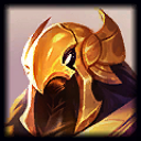
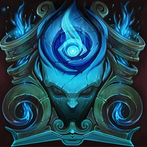
@Riot, Shurima Icon background is really bland compare to others

Fasmodey·7/6/2018, 10:38:33 PM·16 votes·10,543 views

It is just straight, boring color without any other details.

Compare this

https://4.bp.blogspot.com/-Qe0Jv3k4Ulg/Wz_JTGfkZGI/AAAAAAABC1k/nrq83OwjdUUqeLv7ySFyIybWRjIslFmyQCLcBGAs/s1600/3555.jpg

to this

https://2.bp.blogspot.com/-L604dqBngD8/Wz_JSnfFr7I/AAAAAAABC1U/qmy_PibTjA0nIvSAK3tgByxLaEJVVskMACLcBGAs/s1600/3551.jpg

and you understand what I'm talking about.

Please add something in background that makes the icon more interesting, like I don't know, sunshine? Sand?

9 Comments

Stars Shaper7/6/2018, 11:00:06 PM9 votes

For Shurima we had this when Ascension came to be:

http://i.imgur.com/wEt9cpb.png

And this for the SI:

https://vignette.wikia.nocookie.net/leagueoflegends/images/b/bc/Shadow_Isles_Crest_profileicon.png/revision/latest?cb=20170504235549

Not an excuse for making the next ones less flashy but it might be that they didn't want those icons to be too similar and opted for something less shining.

Hyquiem7/6/2018, 11:19:17 PM2 votes

Fun fact they hate Azir

rtbf2256182417/7/2018, 7:20:33 PM1 votes

Targon's is the most detailed out of all of them while the Freljord and Shurima look blurry and low resolution.

Propably cuz they're older icons. They didn't make them from scratch.