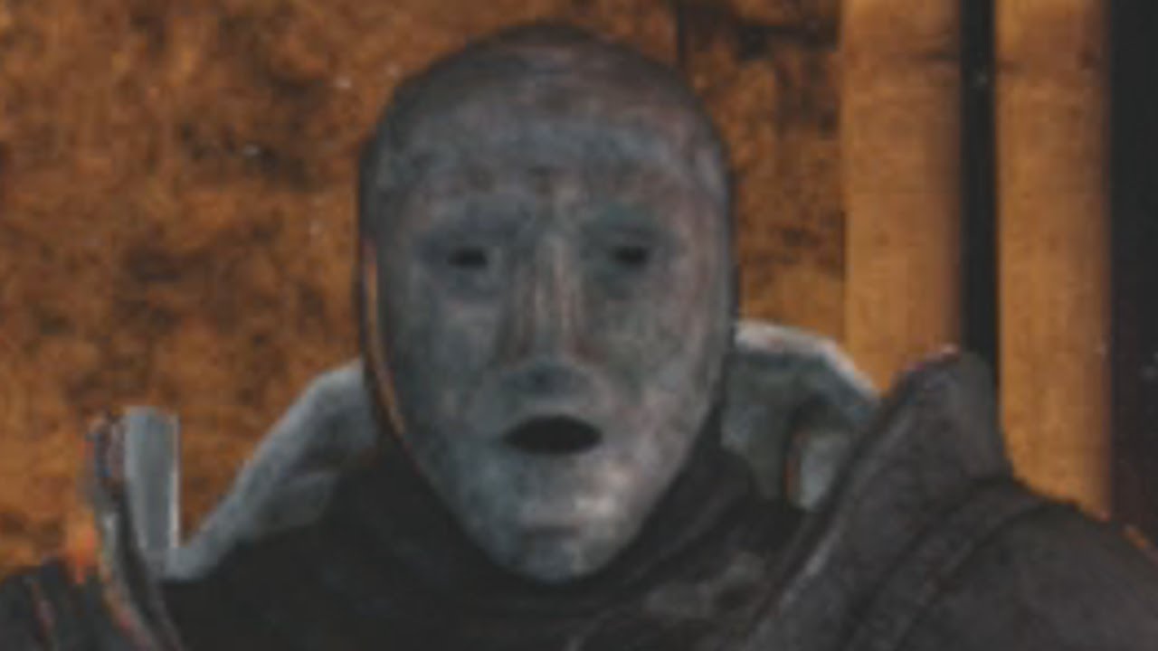
Jihns mask is disappointing

At least change the color and a couple of lines on the mask. The mask model is too different.
At least change the color and a couple of lines on the mask. The mask model is too different.
Wow, you can't even compare, theres like 2 different masks
You do realize that the in game model is designed to be readable from a large distance right?
http://i.imgur.com/w1HXiRa.jpg
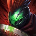
This is more close to what you'll actually be seeing most of the time and even this is zoomed in a little. Most of the time that you play the game, Jhin's mask is going to be like, 12 pixels big.
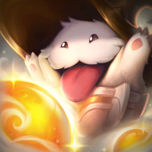
With the quality of reworks such as Poppy's, I must agree that the likeness and quality of the mask is sub-par. Riot has shown how long they have come with intricate details and clarity, so why move away from that? I really like the pattern displayed in the trailer, as it adds more flavour to the character, and fits more with his extravagant style. The current one looks like a more generic mask one can buy at any costume shop.
The other problem is that the mask differs even from that of the splash art, especially the chin part. The in-game version is rounder and shorter, and lacks the pronounced, square gap - it is instead almost triangular and lacks proper shading. The brows are also too anonymous and lack the stripes and pronounciated parts of the splash art.
to be fair, you wont notice that in game... i mean, no one plays with the cam zoomed at max
Made a new mask for Jhin and gave you credit for this thread :) Here is the post: http://boards.na.leagueoflegends.com/en/c/story-art/RYJspP6l-jhin-needs-a-new-and-better-mask-closer-to-the-original
Wooden Mask http://i.imgur.com/jcOwqFT.png
Metal Mask http://i.imgur.com/66yI23k.png
**EDIT: **Delted the old post, and made a new with a more appropriate name.
I imagine the color is for contrast. If his mask was more bronze like the teaser, it would blend with his poncho. Also the mask appears to be the same color in both, its just the lighting in the teaser that give it a different hue.
However, I agree about the lines. The mask should reflect the level of detail better.
IN GAME HE LOOKS LIKE ANDROSS FROM SMASH.
His mask has that Squidward nose look.
Must have gotten it on sale.
I agree
Mmm. I'll sure be paying attention to that when I'm hovering 30 feet over him, watching him run around in circles, manically changing his mind about whether to kill the minion now or half a second from now.
I understand the big ones like the awful pizza-feet, or whatever kind of wolf-jaundice Warwick had for years, but the faces are probably the thing I pay the least attention to. I don't think Jinx would be played all that much if people focused on the faces at all.
considering we just animated Poppy's fucking eyebrows, this is really bothering me.
I'm so tired of Riot picking and choosing what's going to look good and what's going to be half - ass'd. Why bother giving Poppy facial animations and then not do anything of the sort to any of the new champs. -_-
At least a few lines would be nice.
Yep, getting the skin.
He's gonna be one ugly **** anyway really.
Drunk 
Agreed. Make it better, not necessarily perfect, but at least recognizable.
You should see Masked Shaco  It's pathetic. They don't really care if a characters skin looks the same as their splash art or teasers.
remember when  looked like a completely different champion in her splash?
Wow, i didn't think it would be that bad. but just wow
The trailer was him inside his dream/brain so he is how he imagined himself