The Red Shine on Dragon Fist Lee Sin Looks Weird

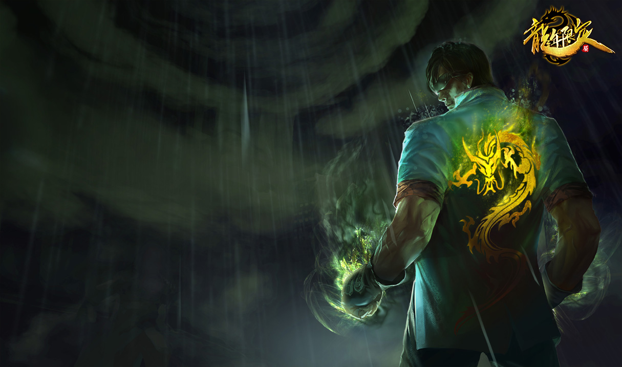
http://lolwp.com/wp-content/uploads/Lee_Sin_DragonFistSkin_Ch.jpg this is the original one from the other server.
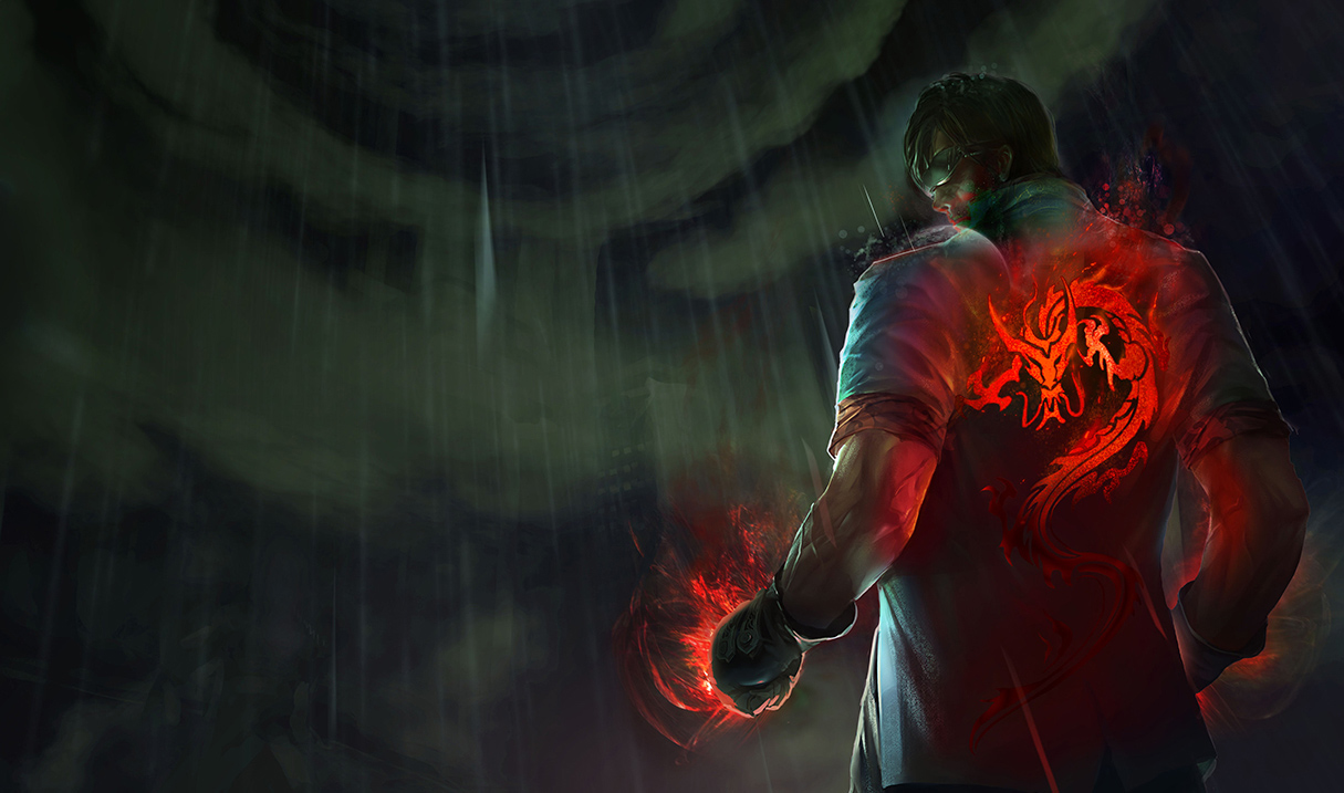
https://3.bp.blogspot.com/-_7_NsIQEBVE/VwVgOodoSpI/AAAAAAAANJI/Nl_afzW_Hwgf4Jiah9Wh9VCnqCV7o8ZEQ/s1600/LeeSin_Splash_3.jpg This is the one edited. It looks a lot darker, which is why it looks bad cause lee sin blends into the background. In this one, some of the effects got removed, and he looks like he have some paint on his face. The lower part of the splash also got cut off, making it looks like he has an abnormally large torso.