@Riot - Disappointed in new ladder ranking artwork
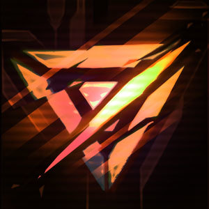
Before the ranking artwork always had a sense of shiny/bling to it. The higher the ranking, the more bling to show off. Having reached Diamond this season, I was really disappointed to see the mute colors and the icons are underwhelming. I understand from a perspective of color scheme going to new style, but the implementation really lacks in connecting to a sense of accomplishment. If you were to ask me, I think the old style is a better reflection of bling and accomplishment than the new style.
Please, please, please redo this or at the very least, don't let it continue next season.