The Reason Why the New Rammus Splash Feels Off

Background:
I love Rammus, he's the reason I got in to the game in the first place. When I first saw the video "Rammus Taunts Everyone" back in 2011, without knowing at all what the game is about, I installed the game wanting to see what this little guy is all about.
To my disappointment, I had to play many long games of Garen before I had enough IP to unlock him. That took a week or so, and I was quite excited when I finally did, taking him to whichever lane is open (oh the naivete). Of course, transitioning from Garen's playstyle to Rammus, I pretty much got destroyed everywhere, though I continued playing him until I sort of got bored of the siesta game after two weeks.
Around summertime in S4 I saw my brother playing the game and that piqued my interest once again, to take Rammus back out for a spin. I decided to learn jungling from scratch despite not even having smite, though most games it ended up working pretty well since none whom I encountered knew how to deal with a jungler (and my friend was always playing ADC lane). We pretty much played the same role and same champ until level 30, so I had quite an impressive match history of Rammus-and-nothing-else games.
The Issue:
The new splash art on PBE left me with mixed feelings. I'm glad that Riot is paying some attention to my favorite turtledillo, but I did not think that the the style they used was appropriate for him. Let me break it down for you.
First thing is the composition of the picture. A large part of his body is obscured by his arms, and we hardly see what he actually looks like. Much of Rammus's characterization lies in his exaggerated appearance, primarily defined by his huge shell and his ridiculous Codpiece. Any pose they elect to show him should display his armor in all its glory. His arm, on the other hand, is hardly a standout part of his appearance. Why is it taking up like 50% of his composition, which will be perceived to be more like 75%?
Secondly, which part of his action pose does it convey what the character is about? Unlike random DeviantArt illustrations, which can be of any theme, a splash art has a purpose. It is supposed to convey, in one simple picture, what the character is all about. Like we see with the static pose of the Elise splash, it shows off her status as the spider queen. What does Rammus autoattacking a rock has anything to do with his character?
Here is an example of a good action pose that shows off the core identities of Rammus:
http://i.imgur.com/DOC0LVc.jpg[/img] ("Come, Get Some" -- Art by Jackrow) Imgur
We see that 1. His armor, in all its glory, has an immediately threatening presence if you attack him. 2. His pose, saying "come at me bro" with the placidly contemptuous expression daring you to attack his armor, immediately shows what his powers are. Finally, we see what effect his action has on the others, with a background character enraged to attack him despite being obviously a very bad idea.
Now back to the new splash art. His shell is very spiky, yes, but it is not positioned as the most threatening aspect, instead we get his paws being shown as the featured part of his threat. Which is hardly an accurate portrayal of his kit.
Finally, something about the texture of his face makes it seems like a lifeless mannequin, and the art style overall seems to be a little dissonant, border-lining on the Uncanny Valley. And this chin is a little too large, making him seem more like a turtle with a snug shell, rather than an armadillo wearing a ridiculously oversized armor
Closing Thoughts
Personally, I loved the old splash of Rammus, I have always thought that the simplicity conveys his placid nature while quietly showing off the threat of his armor by him just being there. The texture and lighting I have always regarded much superior to the other legacy splash arts, that it stands out as of much higher quality than the rest, therefore worthy of being retained timelessly. I am hardly against him getting an upgrade though, just that if Riot were to upgrade his art, it should retain the core identities of Rammus and actually be an upgrade.


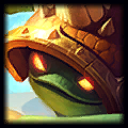 The old one shows a nonchalant Rammus with his arms set forward, and you can just tell that he doesn't give a fuck.


 powering down midlane with the sole purpose of making the enemy
  ragequit. We all love doing that.