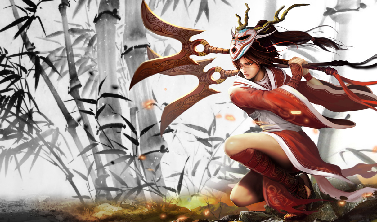
[Skin Spash Updates]: Blood-Moon Akali

Definitely one of my favorite Splash arts of the bunch.
Definitely one of my favorite Splash arts of the bunch.
I really don't know how i feel about this update. The overall design looks good as they kept it quite simple. Thats a plus.
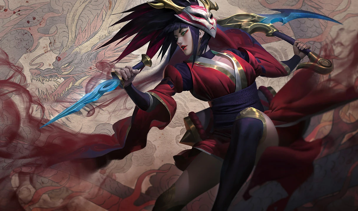
But the splash itself to me look rushed or even unfinished. Akali looks way too smooth to represent the painting-style the original had. Furthermore the hair looks like it's glued together almost like a bad wig. The original put an extreme amount of detail on the clothes and hair. The wrinkles in the cloth and the emphasis on the single strains of hair give the original art a quite realistic look.
The plain background also emohasises Akali as she is the only colorfull spot in the art (apart from the ground but that doesn't really count).
All of that give the original a feeling of a traditional piece of art. The colorfull painting in the background and expecially the smoky extension of her sleves and skirt blend akali too much into the splash.
Also i think she is too big too much the center of the splash, that it makes the contrast between her and the background even less.
The last thing i would criticize is the pose. I my opinion it is too dynamic. i don't really know why but the more still image of the original has more of an arty feeling to it. It's weird, i know.
So by now i basically criticized everything about this splashart. i gues i know now that i don't like it. I guess on its own it would be rather good, but in comparison to the old one, it pales.
Note that i am not proficient in painting or drawing. So all of my analysis is purely based on my personal opinion.
I hate the new one. You know, I've bought a skin, its like, i bought a lamburgini, and then, then you rework that into a skoda. Like ye sure, its still a car, but its not the one that i payed for.
I prefer the older splash art and hairstyle. The newly reworked Bloodmoon model looks WAY better though. As far as the new art goes, Akali's face looks weird and I don't like the straight bang cut she has going. Otherwise the art is well drawn (though I still prefer the older one).
I have to disagree. It's my least favorite of all the splashes for a few reasons:
While the concept is good (being painting-like inspired), it's so out of place. None of the other blood-moons has this concept, or even close to a hint of the idea. Thumbs up for illustration, thumbs down for design thinking.
It looks unfinished (if it is unfinished then this point isn't valid). She looks so flat, but not in an artistic style like imitating a print. It's flat like the bad old earlier graphic days where colors were limited and art in digital world was still developing. Also look at the cleavage area... wtf is that? It's just pink, with no hint of a body underneath.
If the art team decides to go with the painting-like concept, don't make the metal shines. If they decide to leave the metal shine, add in shadows. Right now I have no clue about the relationship of the figure and the background.
Lastly, I just wanted to say I know Riot Art Team is very talented and hardworking, always trying to find new ideas and concepts to make new elevating artworks. However, when there's things that could be improve I hope they look at feedback and take what they can get to revisit the artwork(s).
At the moment, I'm glad I don't own this skin cus even Stinger is much better in comparison.
I want to like the new splash...but the pose, her hairstyle, face of the angle, and the colors are my biggest issues.
Pose: Her body angle looks awfully painful, being contorted like that. Especially, with the head turned a full 90 degrees to the right.
Hairstyle: Very sharp; lacks flow that the original one has. Looks kinda rushed.
Face: Too sharp; most likely due to the angle that it is in. Could be softer like the original one.
Colors: While they are cementing in the Blood Moon colors, I wished they darken colors a bit more, like the other BM champion splashes are. More "night time" feel to match the rest of them.
Generally speaking with reworks, I prefer the new splash art - but I'm not a fan of this one at all.
The old one still looks a lot better. The new one is good, but I'd rather keep the old.
Love the new splash art. Favourite one of the alkali skins so far BUT. Why does akali’s skin look like plastic? Any chance they will retexturise her colour palette on launch?
Are we doing that thing where we're being contrarians? New Bloodmoon wipes the floor witht he old one imo.
This one is one of my favorite splash art updates for Akali. The color and composition are awesome and it retains some of the flatness found in Japanese art yet is dimensional. She suits this new background much better than the old skin with the bamboo, which looked like three photoshop layers chopped and placed together. The rendering is heckin gorgeous. Reminds me of the artist Zeenchin, esp in the hair and in the green in the collar and some illuminated parts of the cloth.
she looks japanese or korean in the new one?
imo her old skin was better cause it felt more asian this one is idk.. the whole rework feels like a ninja wannabe to me
Her model in-game is terrible, her sleeves disappear and her dress too.