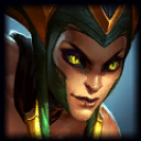
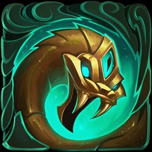
NEW CASSIOPEIA ABILITY ICONS FEED BACK !!!!! RIOT PLS
Nagma is back·4/19/2016, 10:48:09 PM·19 votes·2,637 views

Can we not change the current ones : http://prntscr.com/audiw6 for THIS ??????! : http://prntscr.com/audh3l

The ultimate icon is fine . But OMFG twin fangs are disgusting they went from a beautiful piece of art to some Lazy Paint work . Can we fix that , all the other mages get cool icons with perspectives that fit their spells vey well but cassio get the worst . Can we improve the Q , the W and change the Twin fangs . OR PLEASE DONT CHANGE IT AT ALL, DONT CHANGE SOMETHING NICE TO A DISGUSTING PARODY

As someone who play cassiopeia 90% of the time , i am extremly dissapointed . From these new icons , i rather have no new icons than this joke . And cassio dont need new icons , the current ones are good . the new ones feel so bad .

There is** too much purple for no reason** ( only miasma is purple ) , twin fangs looks rly bad and** they dont look like FANGS** , the purple back ground need to go
miasma could use some work , the icon is not bad , but the colors can be improved . Noxious blast : the purple back ground need to go , it doesnt look toxic ( poison ) it looks like a fart .

Pls change it or dont send it to live because the current one are beautifull , cool and realistic ; it fits cassiopeia spells completly well and they dont need to change to a version who dont even respect cassiopeia .


13 Comments

Valhala Warior314/20/2016, 12:01:46 AM6 votes

the new icons are so bad omfg

Nαgma4/19/2016, 11:08:03 PM5 votes

im a extremly dissapointed , the new icons are just bad ...

Canastus4/19/2016, 11:36:58 PM5 votes

Those icons look simply rushed and very lazy compared to what the other champions got.

Sukishoo4/20/2016, 1:17:04 AM5 votes

I like the new ones more.

Oerba No Naja4/19/2016, 10:57:06 PM3 votes

The new icons are rushed work , they are a joke comapared to the current ones . riot should not release them or improve them A LOT

Princess Emma4/20/2016, 12:53:58 AM3 votes

I like the new icons, they look smooth and rounded and I love the shade of colors. Poison's in fictional works also tend to be the colors green or purple, and Cassiopeia does infect others with poisons, so I understand why they would make it as such.

I do admit that the new icons don't look as threatening as the old ones, and Twin Fangs looks so.....''safe''.

Sue me.

Sona Ping4/20/2016, 12:58:12 AM2 votes

I would prefer a big red circle with a red line through it in front of a shoe store than that Passive icon.

And that's not even what a woman's upper body looks like!!!

Valor Bot4/19/2016, 11:42:06 PM2 votes

I've never been particularly attached to Cassiopeia's icons and have hardly ever played her to begin with, but to me, her new icons actually seem pretty good and consistent with Riot's new style. They're definitely a bit more simple-looking but are much smoother overall, old ones are noisier.

Moonboy654/20/2016, 4:06:14 AM1 votes

her new R icon looks so much better

Q and E look like shit

W looks ok

Passive icon looks meh

AceDavidK4/20/2016, 1:18:16 PM1 votes

Q is bascailly a green cotton xDD and if they r gonna do that to casseopia passiive do that to corki,volkoz,aurelion sol,xerath,etc. I use to enjoy cass but not anymore with dis sht. Like what makes cass cass is her spamming e. item 3070 item 3070 item 3070 item 3070 Cassiopeia

Voidrey4/21/2016, 3:09:04 AM1 votes

now that I got a close look at it, they look like something out of classic old RPG game