Welp, time for a Galio Visual Update again...
Don't get me wrong, it's been a long time coming for a Galio rework and I'm happy with it, but as far as his visuals go.....C'MON.
/cdn1.vox-cdn.com/uploads/chorus_image/image/53562713/2017_03_06_14_21_05.0.jpg)
I'm not usually one to use the forums to complain (or use the forums at all really) because overall, I usually have faith my issue will be resolved in time, but this one seems a bit obvious.
I get that you're trying to fit his style into the new lore work and he's a statue and all, but with zero color aside from the gold trim, he kinda just looks like the designers went "...meh." halfway through carving him out in Zbrush...he doesn't even have eyes.
Contrasted to the rest of the champions which all have great, vibrant color schemes and textures whether it be The Freljord Blue that accents 
 and
and 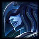 or The Void's Purple on champs like
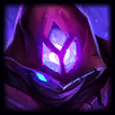
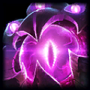 and
and 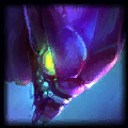 , Galio ends up just feeling flat.
I know people will say, "That's the point, he's made of stone..", but their are a lot of things you can still do with stone from a design perspective. I mean, that's kind of what he was supposed to be originally and I feel like stronger design choices were made the first time around.
A couple of things I will say to his defense: The new kit is great and really revitalizes him as a champ as far as game play goes. Also, his much bigger model sets the distinction he's traditionally meant for top lane.
I'm curious at what everyone else thinks about the new Galio, just glancing over the forums it seems to be a loaded question...So, Shoot!