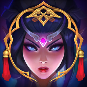
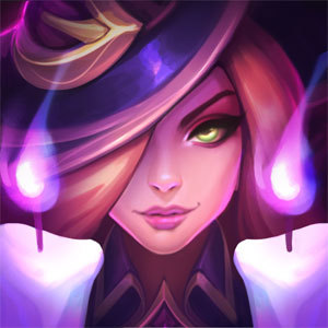
High Noon Borders

Chembaron Yamada·9/21/2018, 7:48:31 PM·6 votes·4,766 views

Maybe it is just me, but there is something about the High Noon borders for Urgot, Thresh, and Lucian that bothers me. I know I am pretty late with this, but I thought that I should maybe give it some time to get used to it, but it still just feels wrong.

I am talking about the positioning of the borders. https://imgur.com/a/laFDbqJ The border looks too short, it is not reaching all the way down to the name of the player. Especially in comparison to these other 2 (Lunar Revel and Star Guardian), the border looks really weird in my opinion.

Is there any chance that this gets changed or is it too late for that?
8 Comments

TheUrbanKitsune9/21/2018, 9:00:06 PM2 votes

Yeah, the Star Guardian borders look more 'complete' in my opinion. They fill to the edges of the loading wedge.

High Noon doesn't quite sit right-- and even the Lunar Revel borders have a sort of curvature to them that keeps them from sitting flush with the nameplates. Namely the Dog-shaped door knocker design in the latter. High Noon could probably be fixed by extending the length a bit and shifting the whole design downwards. Lunar Revel still bothers me, though.

gerbe9/22/2018, 12:08:49 AM2 votes

I never really liked the High Noon borders anyways. They look so weird.

Quiet Dude9/21/2018, 7:50:05 PM1 votes

Id upvote if I could. Now I cant unsee it.

Arakadia9/23/2018, 5:00:45 PM1 votes

All the borders look too cartoony and out of place to me.

Hexs Fortune9/24/2018, 5:51:36 AM1 votes

Something was off-putting about them, and I think you've nailed it