Dear Riot: Not Every Champ Needs an Action Pose

Zaenos·11/5/2014, 5:19:55 AM·82 votes·16,230 views

Dear Riot,

I love you. You're one of the most awesome teams in the industry I've ever known. So know I say this out of love for the wonderful product you've created. You have a strong devotion to continually keeping League of Legends as fresh and good as it can be. I understand that it is in this spirit that you're updating splash arts, and at a great pace too!

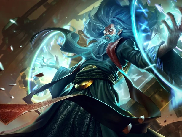
But Riot, not every champ needs an action pose. It's getting a little ridiculous. Take Zilean, for instance. http://img2.leaguecraft.com/lol-splash-art/asset/wallpaper_760px_5012.jpg Who is Zilean? Zilean is an mage who, in hopes of finding a peaceful resolution to a conflict, became immortal. He is the image of a kindly old man, sadly trapped in the side-effect of finding a non-violent solution.

So why does he look like he wants to rip my head off? http://img2.wikia.nocookie.net/__cb20141013221229/leagueoflegends/images/thumb/b/b1/Zilean_OriginalSkin.jpg/614x461x2-Zilean_OriginalSkin.png

Take Lee Sin. A calm, contemplative monk, seeking penance for the wrongs he has accidentally committed. The man set himself on fire for peace, and speaks with the soft wisdom of a sage. http://img2.leaguecraft.com/lol-splash-art/asset/wallpaper_760px_2112.jpg

But then I see this, http://img4.wikia.nocookie.net/__cb20141001054250/leagueoflegends/de/images/1/1b/Lee_Sin_OriginalSkin.jpg I'M SO ****IN' PUMPED IMMA GO KICK A TREE!!

Of course, the characters are multi-faceted, and that scene merely depicts Lee Sin during one of his disciplined training regiments. But is that the image to most accurately portray the core of who he is? You, Riot, have said on many a recent occasion that in-game story and art is meant to quickly relay the essence of a champion. I am sad to say I do not believe this meets that goal.

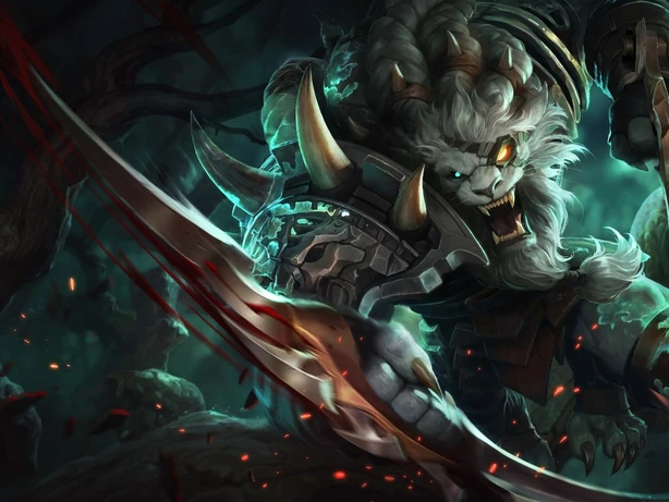
This movement towards high-action poses is curiously indiscriminate. It seems to not only be targeting champions who had previously peaceful poses, but even those who had among the most aggressive splash arts in the game already. Even our great hunter Rengar is being pushed from merely wanting to tear your limbs from your torso, http://img3.leaguecraft.com/lol-splash-art/asset/wallpaper_760px_3272.jpg

http://img2.wikia.nocookie.net/__cb20141008200326/leagueoflegends/images/thumb/c/c9/Rengar_OriginalSkin.jpg/614x461x2-Rengar_OriginalSkin.png to also wanting to flay your skin and possibly harm your mother. Don't get me wrong, in this case I think the new splash art is superior in just about every way. This is a fair portrayal of the ferocious knifecat in his natural habitat. Rengar is an example of where action poses are appropriate. But I include it as endemic of a larger trend of indiscriminate testosterone injection.

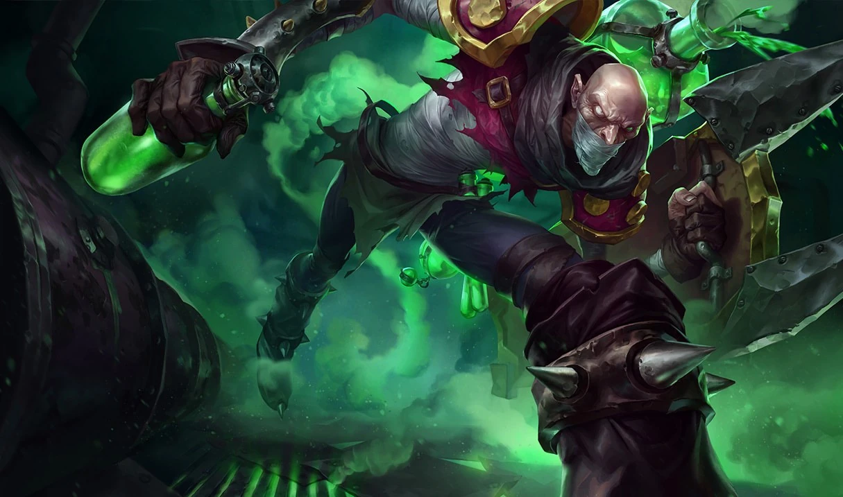
Because in some cases it just gets silly. Singed is a mass-murdering mad chemist, whose splash art could have used some modernizing. http://img1.leaguecraft.com/lol-splash-art/asset/wallpaper_760px_3602.jpg But while I could talk about how he has always been more of a calm, sociopathic kind of insane rather than a raving lunatic, that's not what bothers me most about this picture, http://img2.wikia.nocookie.net/__cb20100211032659/leagueoflegends/images/7/77/Singed_OriginalSkin.jpg It's that he's running with his torso at a 90-degree angle. I've only known one person who would run like that. It was in elementary school and he thought it made him more aerodynamic. But when I look at that picture, I can't see anything about Singed past how implausible that running looks. Seemingly so FOR GREAT ACTION POSE.

http://boards.na.leagueoflegends.com/api/embedly/1/image/resize?url=http%3A%2F%2F3.bp.blogspot.com%2F-EaQxe8J6ee0%2FVDdD1ro2nDI%2FAAAAAAAAaq8%2FxZnzL_ABtM8%2Fs1600%2FUdyr_Splash_0.jpg&key=a45e967db0914c7fb472fd4381e6c85b&width=425 Apparently it's contagious.

Let it be known that I have respect for the artists who made these pieces. They are beautifully detailed and clearly the work of talented people. It's not that these new splash arts aren't better in other ways, or overall, and certainly this is not the most grievous of concerns to the game. But Riot, I would be doing you an injustice not to express that I think you may want to reevaluate priorities within splash art updates. It's okay to have a diverse set of poses and scenes depicting the myriad characteristics and demeanors of the champions, to allow them to be shown not for how forcefully they can dive out of your screen, but for who they are.

Sincerely, -A concerned player

tldr; rito why you make all splashes aggressive not diverse
98 Comments

Featherztorm11/5/2014, 5:34:10 AM22 votes

I think the new art looks great and resembles the champs well. To me it's more of showing their power, as opposed to showing them trying to have a tea party. Looks to me they are starting to depict ulti's in a lot of the art, too. Lee sin's kick, possibly Zilean immortalizing himself, Singed running super fast, and Rengar striking just coming out of his ulti. They look helluva lot cooler, too!

Velivolo11/5/2014, 6:06:48 AM18 votes

I've been loving the hell out of every new splash art that gets released, so maybe I can give some insight in to why I think they're generally better.

It comes down to art basics and composition. Straight lines with characters just standing there are inherently boring. This isn't a personal opinion, this is a standard of design and composition. Straight vertical and horizontal lines are static and less interesting. Diagonal lines are inherently more dynamic and interesting.

There's also a general trend for the entire splash to be more filled and interesting. These "action poses" allow champions to stretch out over the entire space, making that dead space usually behind the character stats and skins more interesting but still not so interesting that it's a waste.

Action poses also allow for a lot of variety. There are so few ways you can draw a person standing straight up and still... And thousands more you could draw them doing something interesting. Too many of the previous character splash arts looked basically the same. With the updates, they're becoming unique and interesting pieces of art in their own right.

Step by step- Old Zilean? Boring, static, so much dead space to the left. New one makes better use of the space, and delivers on the feeling of power that the old one implied (His eyes are glowing and he does have magic in his hands. The artist probably wanted to make him look powerful, not peaceful.)

Old Lee Sin- All verticals and horizontals, dead space. New Lee Sin- Fleshed out composition, performing his trademark "kick" (IDK, Lee Sin is about kicking things, right? And something to do with wards?)

Old Rengo- In better shape than all previously mentioned splashes, but still stale. One nice thing in particular about the new splash is that shiny metal blade jammed right up in the viewer's face... Connected to the diagonal arm that leads straight to Rengar's face. Nice sense of movement there.

On new Singed- IDK, this is a personal perception but he always seemed kind of hunched to me? He carries this huge freaking poison thing, he's not bent over because ACTION, it's because jesus his back must hurt. Just me again, but I always thought Singed was a raving lunatic. His entire strategy is running circles around people while he slowly poisons them to death. What about that doesn't sound balls to the wall insane? Perhaps unrelated, but I like that the new splash makes him look more serious and less like a wacky cartoon.

IDEK what the former Udyr splash looked like. Probably suffered from the same problems of "just standing there stalely with all my boring vertical lines", though I'll admit this is a splash I'm not fond of. Too beardy, not enough beary for me.

Xulsigae11/5/2014, 5:50:20 AM10 votes

I'd like it if the art could be a bit more thematic, especially for the less ferocious champions such as Zilean. He should be doing something that looks...timey rather that 'grrrr.'

patmax1711/5/2014, 8:41:58 PM6 votes

I have a problem with new splash arts too. More or less, I agree with Zaenos. To me the problems are (note that these aren't true for all new splashes, but for most of them):

  • as said, dynamic poses: Some are really well done (Blitzcrank, Tristana), some less (Talon, Lee Sin), some just don't feel right for the champion (Zilean). Some champs just don't need to have super-dynamic action packed poses
  • dramatic angle: More and more of the new splashes don't have a frontal angle, but are rotated, or taken from the lower right corner, or both. This surely helps making the whole image even more dramatic and dynamic, and making the champion feel more important, but if it's don on so many splashes, it loses impact and soon becomes boring
  • few colors: splashes are getting more and more monochrome. While color helps giving the image a certain theme and "feel", there still need to be other colors in the splash, even if just to make the important elements (the champion) pop up from the background. Tristana and Graves are very good in this for example, having cold colors in the background and warm colors on the champion for Graves, and vice-versa for the Yordle. Ezreal is a good example too. A bad example here would be Ravenborn Leblanc: her splash is just a mess of green and blue and purple on green and blue and purple
  • dark colors: related to the previous point, there is the problem of dark colors. I think the problem is particularly visible on the new shen splash: it's awesomely done, full of details and stuff, but it's sooo dark. I get the scene is set at night, but still... Shaco too has the same problem, many details get lost in the dark, and Ahri too (though her splash has been removed from PBE). Otoh, i really like Wukong's new splash, so bright and colorful :)
  • expressions: many champions in the new splashes have this angry, bad-ass expression, or the "evil smile". While it fits some champs quite well (Talon, Kalista), other champions I think have more to say (I feel especially bad for Jarvan here, he's proud and a bit arrogant, not just angry)

These are some of the points that give me trouble with the new splashes that were released lately. Mind that I think technically they are absolutely great, i like the semi-realistic style, the many details, and the general idea. It's just that the elements listed above are just too common, making everything less special and more boring. Kinda like "oh, new splashes? guess 90% will be the same old "dynamic pose, dramatic angle, monochromatic dark palette, angry face"-kind of art... Which is a pity, because it's obvious that the artists are skilled :)

I always thought Magic:The Gathering had the best fantasy art around, but the recent splashes surely have the potential to keep up with M:tG art, imo. Make that potential come out ^_^

Oksana11/5/2014, 2:48:10 PM5 votes

I like most of the new splash arts but please lets talk on some art that really just needs a 2nd glance at. Vayne Vayne Vayne Vayne Vayne Vayne Vayne Vayne Vayne
For me I love the champ I love everything about her. BUT LOOK AT HER HEAD IN THE ICON. WHAT HAPPENED? Shes looks so disformed now Q.Q PlLEAASSEE Someone...

Dolyna11/5/2014, 4:27:38 PM5 votes

Now we need Lux splash art that looks like she's about to tear you in half with her bare hands, complete with an evil grimace. Maybe have her wand impaled through a soldier's chest.

I like her current splash art a lot, but I'm a poor judge of art, so clearly she needs to look more axe-crazy.

Potatofaktman11/5/2014, 12:57:06 PM5 votes

Definitely agree with you on this one, it was pretty much all I was thinking of while I was browsing through the new splashes. Before I say anything though I have to say I think the splash art team are doing a wonderful job and should continue to do so but yeah, as you say some of the splash arts could use a 'toning down' of sorts. Almost all the new ones look like they are running right at you screaming "look at meeeee" and while I agree that this is good on some champions it does not mean it's good on all of them.

Again, compared to the old splashes the new ones look amazing, maybe just go easy on everyone trying to get right into your face next time.

ProphaneProphet11/6/2014, 4:50:05 PM5 votes

I always find it amusing when the loading screen comes up and 4 of the 10 champs share one pose and 3 more share another.

For the most part, I approve of the new splashes. Lee Sin's just looks awkward and ugly to me. I liked his old one ten times better. I agree, though, that all action, all the time, gets pretty stale in this case.

Some champs do better with controlled menace (Swain, Evelynn, and Shen should have this).

Some champs should project contemplative serenity (Soraka should have this, Lee Sin's old, Karma and Yasuo's current splash are a perfect example).

It seems most splashes these days go for unbridled aggression (which is good for champs like Olaf, Rengar, Renekton).

Dynamic and interesting is good, but there's a lot of room for variety within those guidelines. Someone already posted Braum, who is a grand example alongside Yasuo.

Criomhthann11/6/2014, 2:18:29 AM4 votes

They do it because "muh dynamism."

OBRN11/6/2014, 1:17:25 PM4 votes

The thing that really gets to me is that a lot of the new artwork is leaving out the subtle hints present in the old artwork. Look at the new graves splash, for example: Before, the old splash had the cards with holes in them to indicate his rivalry with TF. Now, it's just him just as happy as could be, shooting indiscriminately. Those were things I really looked forward to, as it allowed for lore revelations and more interesting champion interactions.

And I agree with the Udyr criticism. My issue is that i feel like there is even less detail in his design now than before, as less of him is seen, it's hard to make out his physique, his clothing is barely discernible or coherent, I just know that it's tattered, you're absolutely right, all they wanted was an action shot. I don't mind if there is action, but don't sacrifice detail and identity all for the sake of action.

Cenobite Azaziel11/6/2014, 10:10:27 PM3 votes

Udyr. The crazy shaved b*tch-slapping hobo of the wilds. =]

Diostukos11/5/2014, 10:10:35 PM3 votes

The only thing I agree on is Lee Sin. He's a monk, not a kung fu movie star.

Boulderox11/6/2014, 5:19:33 AM3 votes

As a game art major, and taking a digital art class, the huge thing when it comes to making a character, it's a pose. A picture of udyr standing up straight is boring to game devs and players, but if udyr is hunched over, charging headfirst at you like he does in bear stance, that gives more energy and life to the character. Also, the new splashes show off a skill of theirs, not a pose, but an action, Zilean is using a chrono shift/ult (lot of them are ults in the update), wukong spinning ult, kayle using her ult, rengar jumping on you (out of ult assumably), lee sin and his ult kick of death, and finally singed with his struting ult of power. Each splash shows off something unique to the character and tries to push the envelope on the look of the body. Making them longer, drawn out, hunched, devastating. That is what makes a character worth remembering, making devs happy and wowing players I'm sorry that you dislike the new splashes, but i hope i gave some insight on character design