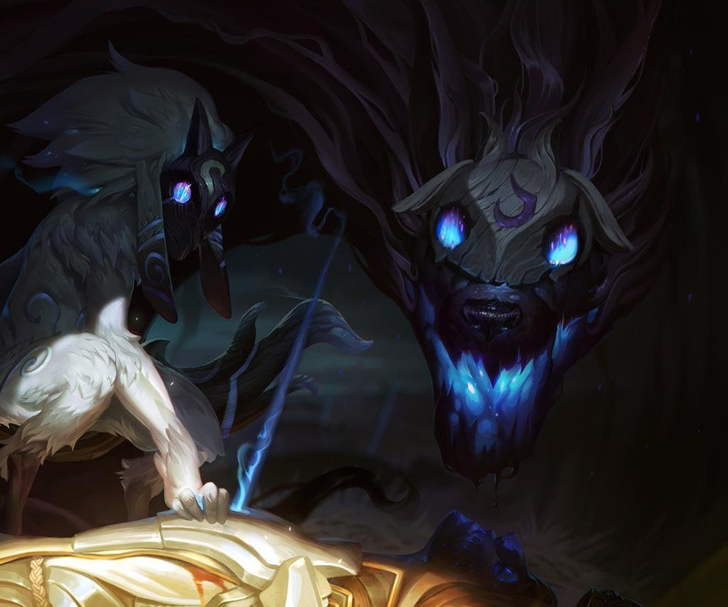
Kindred Splash Art Feedback
https://40.media.tumblr.com/8dbd522aca41a98637a7cc16afbf714f/tumblr_nuqz871NXa1tklhneo2_1280.png
Beautiful art and concept but I can't help but feel like Wolf is a touch goofy looking... Mainly what I feel could be better is refining the distractions from the natural sinister aura he has in his concept art. The large nose and the round eyes (mask) take away from how he's supposed to be.
My first thought is his nose should be smaller and slightly farther away from his eyes.
https://40.media.tumblr.com/7cf038ac83a2f40aae7069b12d8a5972/tumblr_nuqz871NXa1tklhneo1_540.png https://41.media.tumblr.com/a015f15abb3ce40ab34c8ae1f2368d6a/tumblr_nuqzyxq2la1tklhneo1_540.png
And maybe adding sharpness to either the eyes on the mask (might conflict with the concept though) or creating more of a slender definition to his eyes under the mask
https://40.media.tumblr.com/6d8be38477d78fba82d7e266ac151dad/tumblr_nuqz871NXa1tklhneo3_1280.png https://41.media.tumblr.com/61145aa9db47b72c0f42f596dc95a324/tumblr_nuqzyxq2la1tklhneo2_r1_540.png
Or
https://41.media.tumblr.com/8cb3fda8cf9ef579288ceb5392c30c73/tumblr_nuqzyxq2la1tklhneo3_r1_540.png
I don't know, what do you guys think? (sorry about crude Photoshop lol)