Why does RIOT alter icon art?
I know art is subjective, but I never understood why RIOT constantly redraws art assets like champion icons, especially since newer icons often come out as more muddy, and less defined. Shouldn't the goal of the art team be one, consistent look? I mean is it me, or are these 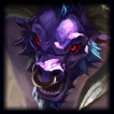
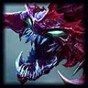
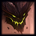
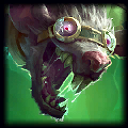 much harder to discern at first than these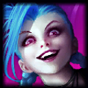
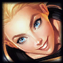
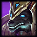
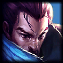 ?
?
So why the heck do a good majority of the icons have to have this stylized, harder to distinguish, jagged look, while plenty of newer champs are launched with amazing looking icons?
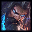 is particularly bad, in my opinion. It has since been edited a little, but when it first came out a friend kept mistaking it for Gangplank. It's since become a joke between our group, but it's still pretty hard to make out who it is.