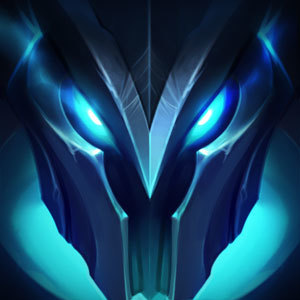
Eternum Cassio's summoner icon and the way it appears on the summoner profile

Snaketits·11/26/2017, 2:32:59 PM·13 votes·2,257 views

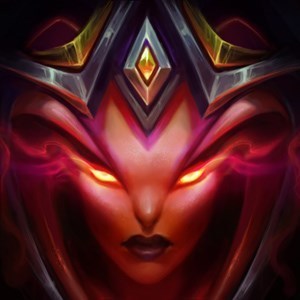
The focus seems to be too much on her forehead whereas her mouth is cut off by the design of the summoner profile. That's not very pleasant to look at.

Don't you think the alignment could be a bit better on this one? Maybe you could move things a little bit up for her?

https://i.imgur.com/x3Vx6Oe.png

9 Comments

Malicious Metal11/26/2017, 2:36:06 PM8 votes

A lot of icons share this problem and it's really triggering my OCD.

Riotmoonstones11/28/2017, 6:22:48 PM3 votes

Hey!

We chatted on Twitter, but for visibility's sake, I'll reply here, too.

I checked it out with Riot Time Wizard, and it doesn't look like what you're showing on our end. It may be an issue of screen res, which isn't something my team is responsible for. It'd be a larger scaling issue with the client. This is something I'll be looking into today, but I have a feeling it isn't an issue with the icon itself. Could also be an issue with the UI? I've got a few things I need to check out. :P

This is what we're seeing - I don't know why the numbers are misplaced, we're on an internal testing build, but it mirrors PBE/Live.

https://imgur.com/nVFCCnx https://imgur.com/ms4LazG

If anyone else owns this icon and could provide a screenshot, I'd appreciate it!
Krigjer11/30/2017, 2:09:06 AM2 votes

At this point I wish they'd just listen to feedback and remove the circle icons and give us back the squares. I don't really care if it 'might look different based on your resolution'. People prefer the square.