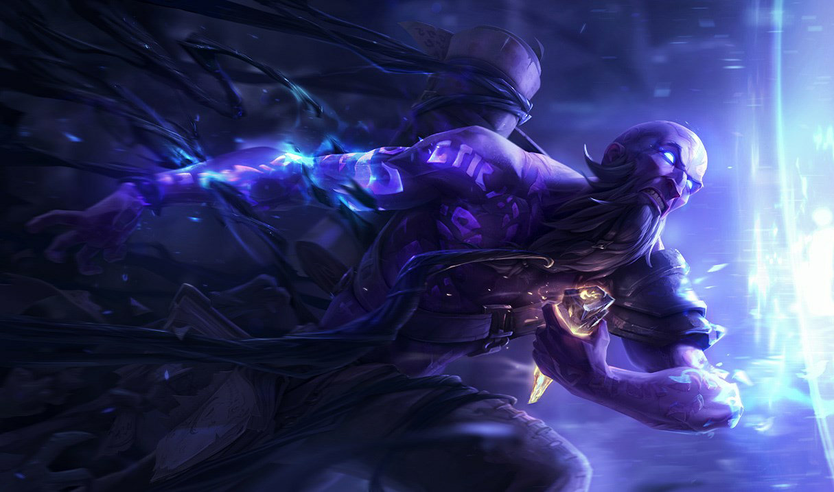
just thinking over this whole discussion on action poses in splash arts

Sunflowers·2/13/2015, 10:05:48 PM·20 votes·3,326 views

i'm waiting for my client to scan/update and on the front page there is the article preview talking about kassadin and ryze champion updates, using both of their splash arts as a background for the short summary.

the ryze splash in particular caught my attention

http://ddragon.leagueoflegends.com/cdn/img/champion/splash/Ryze_0.jpg

this is an action pose/shot i think is pulled off incredibly well. there's a lot of beautiful detail on his body, clothing, background and floating book in front of him but it doesn't feel like a forced shot - it feels like we are seeing a moment in time and the splash art reads very in-character for me. it's an interesting pose that has movement to it and it's telling a snippet of a story.

compare it to the katarina splash art that's created a buzz in the community. for me, her splash art feels less like a moment of a story caught in picture and more like looking through a piece of distorted glass at some wild action occurring.

another comparison:

http://ddragon.leagueoflegends.com/cdn/img/champion/splash/Akali_0.jpg

definitely something again catching a moment of action in a frozen frame - the body movement here feels like it flows with her ability, her body isn't stretched out in strange ways, the colours aren't harsh but mesh completely with the scene we are seeing depicted.

the ryze and akali arts are both incredibly beautiful but also very powerful in what they are telling us about the champion and about what is going on in the scene given to us.

unfortunately, the katarina art falls very far from that mark and just speaking for myself, i would like to see katarina keep that hard, vicious edge given in the updated splash art but have more natural flow to it like these two examples i've pasted here. less pushing too far into an extreme and tone it back to really telling a story about her, showing her true colours without all the unnecessary skewing of body parts and overly dynamic poses/movement. we have plenty of other splash arts to look back on that do tell stories in just the right way that are specialized for the champion - warring kingdoms jarvan, for example, is not a splash art that is super dynamic pose or has a lot of movement in it but there is a story there being told, no doubt. jarvan's personality shines through clearly.

in viktor's updated splash art, you can feel the power from just a glance. you can get bits and pieces of what type of champion he is just from the way he is standing. little things like this are what make a splash art amazing.

going so far as the katarina art isn't necessary - the riot artists in the past have shown us they are more than capable of telling legit tales with a single picture, of bringing forth such beautiful detail in armour and weapons! a lot of this is lacking in what we see in katarina's art right now - it's a mish mosh of action stuff. while i am grateful for some parts of it - the detail of the scar on her face, the changed face shape so she's not so "cherub" like as another person mentioned in one of the threads here, the de-emphasis on an overly pushed up chest - it just takes some of the proportions and the movement a bit too far and doesn't tell a story as much as it could.


6 Comments

KFrost2/14/2015, 3:43:39 AM5 votes

I'm not sure if you said anything about what i'm about to say in the post cause i only read a bit of it... but.

i think the thing people a have a problem with the new kat skin is well a few things... that make sense

The Face

  • honestly the face with a bit of touch up could be better. i think they took the same direction as the warring kingdoms kat face it'd be just fine but right now it kinda looks like shes a coked up drug addict who didn't get her fix.

her hips/legs -they just look weird, and skeletal,

The Motion Motion is fine depending on the pose/scene/position

1.pose -her pose is ok i guess, its a good poster pose but for a splash that's supposed to show off what a champs supposed to be about and not just in game, it also mean the character itself.

-(ex. Ryze: in the picture you used it shows a very powerful pose, and with the distortion and effects going around him he invokes a certain presence of grand power, which ties in with the lore that riot is trying to do something with)

-kats shows some of this but i fell its lacking might be because i'm not sure about the character art itself

  1. Scene -Boring as hell, we got kat flying through the air with some grey baddies dying in the back..... exciting

  2. Position -i think its fine, honestly now that i think about it if they fixed some of the stuff ^above^ it could be a really good splash and not just a meh splash.

AND THAT'S MY OPINION, please prove me wrong, i like back and forth discussion :)

i just skimmed over the rest of the post and realized we agree on most things lol

Ashes Arise2/14/2015, 2:46:52 AM4 votes

I agree with the pose on the akali one, but I still think the splash is a bit ugly.

Oleandervine2/15/2015, 6:05:35 AM2 votes

That Katarina splash is trying WAY too hard. That artist who's done it is probably also responsible for Sweetheart Annie, who still has the weird foreground fetish that the artist feels inclined to add to all of their work, but for the most part, Sweetheart Annie looks fine as she has an "Alice in Wonderland" feel to her. Consequently, if this is the same artist responsible for the Tristana artwork, then Riot should seriously reconsider removing this person from their splash art team. They can do great art, don't get me wrong, but if one person is responsible for Katarina and Tristana, as well as the other, weird depth challenged splashes, then they should be booted. They definitely need to go back to art school and study depth and perception more, because their fixation with using it as a point of action is, first of all, uncalled for, and secondly, they fixate so much on the warped perception of space that the character and the window through which we view them becomes twisted and warped, to the point where we as consumers of this artwork very easily notice the flaws in the perspective and improper proportions of the champions. Changing our view on the depth in which we view these pieces does not make them more spectacular, especially if the subject appears more inhuman than they should (or in-yordle, or in-void, etc, etc). What makes a piece more exciting is as the OP said, capturing a natural looking scene that would appear to be through the lens of a camera. Katarina is perfectly capable of being an interesting subject without the god-awful warped perception. She's a spy, an assassin, and if the popularity of Scarlett Johanson as Black Widow has shown us anything, then there is a way to make it look sexy and exciting all in one fell swoop. Same goes for Tristana, and EVERY OTHER CHAMPION. They're all exciting and crazy in their everyday lives without the need of foreground fetishists to try to make them more interesting to us. Just capture a normally proportioned moment of their lives and that's all that's needed to make us consumers of the artwork content.

Jacccey2/15/2015, 7:06:14 AM1 votes

great post. you are so right about the unnecessary proportions. sometimes you dont need to push that far to feel the power and movement