@Riot - Hecarim still is too insignificant in his Worldbreaker splash


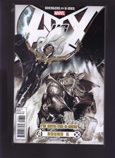
This is Worldbreaker Hecarim's splash. Nasus takes the center stage, no matter how you orient the picture (as its reversed for Nasus). Hecarim is done in too many dark colors that make him disappear into the background, and with Nasus being bright and lit up up front, this is particularly problematic for getting Hecarim some spotlight. Here's an easy alternative. Below is the cover for Avenger vs X-Men #6: http://static6.comicvine.com/uploads/scale_large/7/71975/2415518-prev_img.jpg

This is the first variant for X-Men lovers: http://thumbs.ebaystatic.com/images/g/3iQAAOxygPtS02hz/s-l225.jpg
This is the second variant for Avengers lovers: http://thumbs.ebaystatic.com/images/g/eaUAAOSwJcZWcgcG/s-l225.jpg
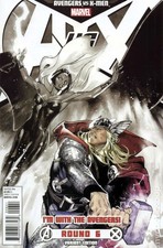
As you can see, the non-emphasized character has been grayed out to diminish their presence on the cover. If you guys insist on keeping Hecarim so dark and in the background, please consider using this technique to make him noticeable.