---> [POLL] <--- Old Fiora v. New Fiora Visuals

Probably one of the most unnecessary "visual updates" they've ever done, IMO.
Probably one of the most unnecessary "visual updates" they've ever done, IMO.
The people voting for the new one don't have a good view of it from those pictures. In-game it looks horrendous, easily noticeable when fully zoomed out. Here's some zoomed in pics:
http://media-titanium.cursecdn.com/attachments/67/663/fiorabasemv.jpg
http://media-titanium.cursecdn.com/attachments/67/664/fioranightravenmv.jpg
http://media-titanium.cursecdn.com/attachments/67/665/fioramusketeermv.jpg
http://media-titanium.cursecdn.com/attachments/67/666/fioraheadmistressmv.jpg
Whoever the artists behind this are, they need to be told very clearly that it's not okay by any stretch of the imagination.
Not just unnecessary but out right bad, everything here isn't just a bad version of Fiora it's bad period, the Liefeldian Build and Pose, the bland background character like cloths, it's just out right bad.
Old Fiora splash art is one of my favorites, if not my favorite, splashes in the game. I already don't like the new splash (nothing can replace the perfection of that splash) and if they keep Fiora looking like some cartoon villian, I will never forgive.
Srsly the new Fiora base skin doesnt make sense. Why is she blue and white again? Why is she wearing a leotard, a corset and a Space Marine sized pauldron to battle? The old one has grace, style and practicality because it meshes light armor with her clothing like one single piece, now the rest of her body is skin tight while her shoulders stands out like a fucking Venus trap. Furthermore, the old armor is form fitting and sleek, it's armor, but it doesn't flare out but keep it reserved fitting for a stylish and gracious duelist. Now all of her new stuff has FLARE EVERYWHERE like come on guys no one needs clothing that big and flamboyant, certainly not one who talks about grace. The new base looks like a scrapped version of Order of the Lotus with the color scheme and the mega leaf shoulder thing, but it is definitely not Fiora
Looks at the right pic which compares their faces Looks again Dies in laugh
http://apollo-na-uploads.s3.amazonaws.com/1437527693/Skins2.jpg Ahahaha Aaaa Ohhhh
I mean it, I've never had such laugh from anything in this game. Ever.
I just can't explain how bad the new Fiora looks, how blind Riot is, and how bad they fked up.
I hope this is some sort of April Fools stunt because this is an atrocity, literally worse than Hitler.
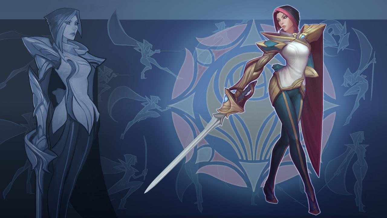
It's just sad, cause Fiora looks really cool in her Concept Art...
http://3.bp.blogspot.com/-Q50J2dYPUbY/Va6JPIeODNI/AAAAAAAAt7Q/8XI_MSB_Bq8/s1600/fu-banner.jpg
And then it's like something was literally lost in translation, cause the splash and ingame model look just really bad. That aliasing on Nightraven... nice DS graphics Riot
http://i.imgur.com/oNQz27O.jpg[/img]
Riot fixed it there you all happy?
Riot for the love of god ,Stop trying to fix whats not broken.
There is no reason to take a champion people identify with and CHANGE THEIR FACE. If they want to change her clothes because her old outfit made no sense, fine. Upgrade her model? Fine. They're an ugly abomination like old Sion? FINE! But Fiora did not need to be changed into a new person. The person that people identified with in different ways is being removed from the game and replaced with someone that looks nothing like her.
Oldschool Fiora is so much better.
Didn't a Rioter recently say that her visual/art update would be small scale, even smaller than Miss Fortune's? If so, it's clearly a blatant lie.
They changed the majestic looking Fiora into something that rivals Shrek in terms of attractiveness.
By far her live model looks 100x better. Although I love the new splash art I just can't with her face.. It's too, plastic-y.
I will miss the old Fiora and her splash art ;( They give new models to champs that don't really needed it  (IMO, Fiora model is fine right now)
AND meanwhile: 











 HAVE THE SAME MODEL SINCE THEIR RELEASE (2009). They need a new model (visual update SION SCALE) but, i keep thinking they will never get a visual update because of their prices (IP/RP) too low... Its so sad.
Splash art - face looks too sharp and cartoony Ingame model (face) - face is especially ugly, clothes and other stuff is o.k Headmistress skin - again, ingame face kinda ruins the sexiness, also her boobs got smaller?
Went from the best looking female champion to one of the worst. Even this  face is better.
500+ votes, but they won't even read these posts
personally I would prefer a middle ground. I like the new fiora's breastplate more than the old one, but I like the old ones cape better. I like how they removed the dagger because it was something that was never part of her gameplay. I like her new stance, but I miss her old armored pants. her old face was far better though.
Old. No question.
Let the royal guard have the new one's hat though.
I might be a sucker for that style of hat <.<
I LOVE the base splash clothing. I dislike the face in everything. Chin looks like that of a dude. A manly dude.
FIORA'S CHIN RIVALS THAT OF  IN MANLINESS
The Royal Guard Fiora clothing sucks as well, but not all skins are created equally and that is just my preference.
So my vote was old fiora
These kinds of "polls" are very confusing and misleading. WHAT about "old" and "new" Fiora are we comparing in terms of visuals? Their splash arts? Their designs? Their in-game models? Because honestly I have different opinions for all three of those things and this kind of thread just encourages a lot of unnecessary, misled, and overgeneralized hate.
No idea why they invested time into doing a VU on a relatively modern champion anyways. I get the kit rework... but nobody was complaining about her visuals.
Mean while... 
I cant help but feel the only reason is to make her easier to make skins for. But id rather no skins and keep the original. Unless the new skin hides her face lol
my only complaint is headmistress fiora's skirt is not right enough as it is depicted in the splash art.
The splashart is a little intense, she looks like a chonga, but I realy like her in game? I think the large and gaudy matches her personality
I like the new ones on all the skins except the last one. I don't know why, maybe its the new colors (on the base skin at least).
The new Nightraven Fiora's face reminds me of blood and night elves from WoW
The composition is better on the new one.
But the anatomy is off, and the entire thing looks is lit and textured like rubber under a flashlight. The face, is more caricaturized than a lot, but not really bad. I can understand peoples complaints though, as it just really isn't an attractive face compared to the previous. And as my old Artistic Anatomy professor said, there is no amount of composition that can make up for a bad drawing.
Plus, does anyone else get a completely unfitting space cadet feel from her new outfit? It just really doesn't look like anything else in the game, like she's a port from another game, an alien, or a time traveler or something. I had similar complaints with Ekko though, so maybe that ones just me.
EDIT: FOUND IT! I knew there was a specific scifi uniform it was reminding me of, just imagine this in white.
Okay, the changes to her face in her models are UNDERSTANDABLE except for her headmistress skin.. That "then/now" difference is almost inexcusable (unless riot was trying to get the update out fast and is planning to go back and touch things up.) Her new splash really isn't that bad, its good imo. What I hope is for Riot to use the same face the old Fiora had because she had one of the best faces in the game haha.
Other than that STELLAR work on the update to her kit Riot :)
I really hate being one of those guys who complains about the visuals, but tbh i'm just confused here. Fiora's visual identity was fine, it was modern enough, no major thematic inconsistancies like Sejuani's Winter Bikini, and displayed her character to a Tee. I'm just not certain why they decided she needed a full on VU, when they could have cleaned up some of the original models and made her hair more natural.
As someone who has a great amount of respect for Fiora's identity, despite not being able to play her competently myself, I'm a little sad. I don't think her new visuals are crap mind you.....Save for one thing
PLEASE PEOPLE. STOP. MAKING. GIANT. SHOULDERPADS. Those are WAY TOO BIG.
To be absolutely honest with you guys here, If they gave her back her old hairstyle, and slimmed down her fucking shoulderpads from being made for Garen to being made for a fencer then I'd have little problem with it (Despite my absolute love for her original outfit, God i wish they still did Traditional skins).
The new splash is gorgeous. The new base skin needs less blue, but is also fantastic.
BUT NOW THE SKINS ARE HIDEOUS... D;
I like the new model, but her face looks really bad. If they touched up her face and hair on the new model, it would be perfect in my opinion.
And fix her damn face in the new splash art!
I actually like much more the composition of the new splash, and the concept art was sweet, but the face is awful. It does have a certain style and personality, but I don't dig it. The composition running around here with the old face looks much better (imho).
And the royal guard and headmistress models are awful. I do like parts of the normal and raven skins.
I think fioras new model needs the same color pallet as her old one but i still like the new model itself.. just not the colors so much :(