About The Recent Splashes.

Before I begin, I would like to say, I prefer the old splashes, there's nothing wrong with them, if you want an update, then update the splash, don't replace it, please. We've been saying this a lot, there are splashes we didn't think needed to be changed, just updated with color shifts and proportion changes.
Now, about the new Katarina splash.
It's a major shift in appearance, there's nothing wrong with the stance or the colors, and I love the motion captured here, but the face is very off-putting, it's much too long, and has a kind of harshness to it that makes her look very old.
With the recent string in splash arts not fitting in with community opinion, I would like to know very much who is actually doing them, because all of the new splash arts have been designed by the same person. Someone who likes pointy chins and slender, angular faces WAY too much 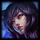
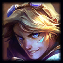
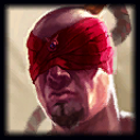
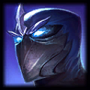

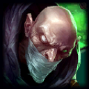 (Really amazing splash imo, but still evidence.>
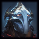 .
.
Please Riot, tell us which artist has been doing this so we can critique and share our community opinion! We're the ones who are going to be seeing this stuff 24/7!
I INVOKE THY HOLY NAME, PARROTED LORD OF THE FERROUS STYLUS!
::edit:: Another issue I found with the splashes, is the reason for the odd angles, whoever is doing these is using a fish-eye effect in some, to different degrees of success.