Gravelord Azir colour fix and new icon for Lionheart Braum's passive
To stay closer to the splash art, while at the same time improving clarity for the model when in dark green areas, I have adjusted the dark green colour of Gravelord Azir to be dark purple instead. http://img.photobucket.com/albums/v709/stigtrix/Concepts/LoL/Gravelord%20Azir%20-%20Comparison_zpsxh5ag9lc.png I also find that the dark green does not fit the skin as well as a dark purple. It feels out of place in my opinion, and conflicts too much with the other colours - both the model colours and the colours of Summoner's Rift.
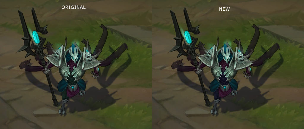
I think Lionheart Braum's passive deserves a small change. Making the symbol a lion would in my opinion not be the right thing, as it would make it more difficult to include a lion for a higher tier skin that can utilize it better as part of the concept. A small tweak to the two symbols in the middle to make them form a heart would crave little effort and be more in line with the theme. http://img.photobucket.com/albums/v709/stigtrix/Concepts/LoL/Lionheart%20Braum%201.1_zpsgvx4qkej.png