Irelia's splash is a stain on the game's visual identity and here's why

Riot just ignores this issue in for years now and it's getting frustrating.
Did you know? Irelia's splash is the chinese one and the artist who was extremely lazy and untalented copy/past a radiant green on the background of the splash instead of finishing the artwork.
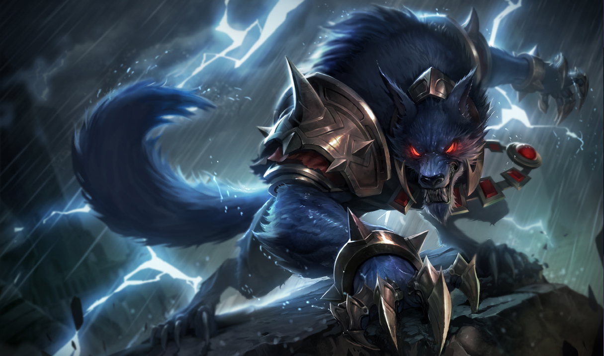
Besides let's not talk about her disgusting skeleton face and body measurements, the hideous blurs and textures of the background and of course the obvious lack of the sky. It's sad that she is almost the only single champion left in the game with a low quality splash while other champions like Warwick or Ryze got a new one EVEN BEFORE they got reworked.
We're talking about a game with lots of talented artists and very strict visual identity. I get it that skins needs time, but this classic splash is the main identity of the champion since it's the primary ressource showing for everybody. This splash should not be and tolerated in the new client anymore and to me is a clear stain in League's visuals.
For the record, this subject has been discussed over and over without responses. It is also safe to say without any doubts that Irelia's splash in the current patch is the worst classic splash art of all of the champions (art/technical wise).