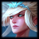
I figured out why Janna's Splash Art makes me blue...

The Stoic Hero·11/14/2014, 7:01:49 PM·101 votes·12,766 views

It literally has too much blue value. Despite changes to her character, the picture itself seemed off for some reason. The amount of blue in the picture makes her seem cold at best, but nearly corpse like at worse, resulting in the uncanny valley effect. Just giving the picture some warmth makes it far more palatable.

I would like to see some of the other issues fixed, like her tattoo brought back, neckline fixed, and more expression in her face, but just fixing the amount of blue softens up her facial features, and the entire picture, tremendously.

74 Comments

Tsunday11/14/2014, 7:07:33 PM25 votes

I actually like the one you did for this, even though I feel like the high concentration of blue has to do with her 'being in the sky' in the picture. I kind of hope they reconsider the hue of her current splash art.

As for the tattoo, no. She doesn't have the tattoo in her in game model she doesn't need it in her splash. The art for the splash itself is just fine without the tattoo

Orbv11/14/2014, 7:41:37 PM18 votes

I like your more golden one. It looks like she's floating in the horizon during sunset. That's how things ACTUALLY look in the sky. Why does her staff glow blue? Shouldn't it be bright white or clear because she controls...air?

Awesomeisme211/14/2014, 9:19:24 PM10 votes

I think they should return Janna to her old splash art, she looked better...

Janna

Adrenalotr11/14/2014, 8:36:31 PM8 votes

I think the best value is something that's representative of her colors in-game, so probably something in between the two. A lot of Riot's more recent splashes has had a lot of dramatic, flavorful lighting, but it makes the portraits (especially the portraits) and splashes somewhat misrepresent the colors of the champion. it's one of those CLARITY! things Riot has been talking about.

deborahcliff11/14/2014, 7:16:24 PM6 votes

i think it's because of the blue light of her staff.

but i agree that her expression is very impassive and out of character. looks like she belongs in bleach.

SlackerboyTC11/14/2014, 8:39:09 PM5 votes

blue value makes you feel blue?

manbearswine11/14/2014, 7:56:00 PM5 votes

Or just face the fact that the old one was better.

Modmar11/15/2014, 10:15:31 AM5 votes

Personally loved her old splash more than this new one, even your edited one. I miss her tattoo, for those of you wondering she use to have a tattoo in her splash and I'm fairly sure she had it in game too until recently. Not sure why they went with a very impassive stern face with such a lighthearted champ, that'd be like making Lux's laugh into a hardy grunt of a war veteran. Please return her old splash and tattoo or improve the current one Riot.

Dreddeth11/15/2014, 1:02:08 PM5 votes

You raise a good point which I had not thought of before, but the main reason why I hate that splash is that she now looks like the bulimia fairy, which contributes to the "corpse-like" effect you described. Someone, quick, get her a 5 course meal before she faints.

Gaminon11/15/2014, 12:29:11 AM5 votes

I'm blue da ba dee da ba di...

Dennner11/14/2014, 7:24:24 PM5 votes

I feel like in the splash art on the left she's some kind of champion from the freilijord. It just looks like she's shooting ice cold air, like shes supposed to be making a snow storm or something. idk Rito, im pretty sure i just came up with some kind of new skin idea. gg wp myself

AdgharKH11/15/2014, 7:44:49 PM4 votes

I hope this isn't too off-topic (maybe I should start a new thread?) but the way Janna's face is drawn makes her look like a soulless undead construct. Maybe it's the proportions, maybe it's the angle of her chin. I dunno. All I know is that her portrait disturbs me.

Janna Janna Janna Janna Janna Janna Janna Janna Janna

Quibblie11/14/2014, 10:59:50 PM3 votes

I rarely comment, but I logged in just to say that this looks WAAAAAAAAAAAAAAAAY better than the current splash.

Padagi11/14/2014, 8:28:32 PM3 votes

I think I actually like the blue one better. She seems more serious and more menacing. In the green one that you've done, she looks too friendly and welcoming to be a battling champion on the Summoner's Rift.

In any case, WHAT tattoo are you talking about? O_o

Hex the FenFen11/14/2014, 9:47:41 PM3 votes

The pointy chin kills me, it kills me

Kirruu11/15/2014, 1:26:20 PM3 votes

I really like what you did with it. This also reminds me of how blue Ezreal looks on his Champion Icon... I thought I was playing a smurf for a moment.

ArcticSirius11/15/2014, 12:38:27 AM2 votes

I love what you did, makes it feel more welcoming. Looks like a dawn setting instead of her just being "high above the clouds". Hopefully Riot looks at this

Ad Astra per Asp11/14/2014, 10:53:46 PM2 votes

but she's a wind spirit and they live in the blue wind...wait.

Meruvin11/16/2014, 5:22:55 PM2 votes

The edit definitely brings warmth and welcoming feeling. The feeling you should get from a champion like Janna.

PureMystic11/15/2014, 1:43:56 PM2 votes

She's creating a storm, that blocks out sunlight in nearly all weather phenomena. So the brightness really makes no sense with her powers, as there shouldn't be sun during a storm. Also her body looks fine for someone whose lore says she's no longer supposed to look fully human. So the fairy look works with her magic-infused body. The tattoo i really didn't care for so eh. But the changes most people are complaining about should look at her lore and her powers. It makes little sense to dislike the new splash based off that alone.Janna

pokecrater111/15/2014, 1:50:45 PM2 votes

Good points. Although, there has been some unrest on the matter of the splash arts containing features that doesn't show up in game(ex: Janna's tattoo). I have bad eyes but I do like your edit more than the original as it reveals Janna's skin tone better.

Sukishoo11/14/2014, 8:04:35 PM2 votes

" like her tattoo brought back"

No. We don't need that considering it's not on the game model itself.

Avious11/15/2014, 10:39:59 AM2 votes

Even though it's not only because of the colours that she looks like a sprite your suggested change definitely improves the splash art.

Scrimshäw11/16/2014, 5:02:51 AM1 votes

here's a thought.

who cares.