Dragon Knight Mordekaiser just needs ONE change in order to be absolutely perfect!
Malicious Metal·6/9/2019, 11:45:18 PM·32 votes·16,629 views

Thanks to the effort of Neal Wojahn, the amazing VFX artist who worked overtime to get us Mordekaiser players some awesome custom VFX, Mordekaiser will be released with an exquisite skin catalog that offers so much stuff to love!

https://youtu.be/gCZWWml9QGY?t=453

My personal favorite skin, though this is a lie since I simply cannot just pick one, probably has to be Dragon Knight since it really checks all of my favorite boxes.

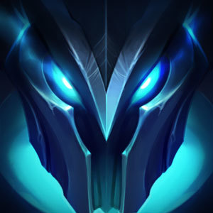
It has just one flaw, one tiny little detail that actually somewhat breaks the skin for me: #He loses his ferocious Draconic Visage to gain a hooded head during his ultimate.

This kind of goes against the thematic set out by the skin; trying to deliver on the fantasy of literally being a DRAGON Knight. His ultimate is supposed to be his high moment but it just leaves a sour taste in my mouth since it just seems so completely out of character for this skin's specific thematic.

The hooded look is amazing on his base skin and Lord Morde, where it really drives home the message that he's this impossibly ancient Revenant encased in metal armour, but this does not really carry over to the Dragon Knight skin.

Infernal, also a 520 skin, keeps his hellish helmet on during his ultimate, so I think it seems completely reasonable for Dragon Knight to also retain his curved horns and simply have his crown hover between those.

It'd definitely solidify this skin's theme and crank up its awesomeness a couple notches. https://pbs.twimg.com/media/D8QcmgdW4AIM8xx.jpg

10 Comments

King Livid6/10/2019, 12:34:30 AM23 votes

I get a sour taste in my mouth everytime I see Lord Mordes Q E and auto colors.

I agree with you on removing the hood for Dragon knight, and I think it should be the same for King of clubs. King of clubs is supposed to be thematically royal, and the black hood doesn't help that.

I'm annoyed that only the passives were adjusted. It looks so odd, because green and purple (Lord and dragon) do not work together unless you're a psychotic clown. A re color isn't too much to ask. No new animations/effects needed, just a recolor.

ModRowanstar6/10/2019, 3:05:51 PM3 votes

I love that Pentakill Morde is a remnant of the old Morde (pre vgu) with his same helmet and armor. I also love that he looks so smooth as do the other skins. But Lord has to be my favorite as the purple gems and spiky mace and evil horns look so cool. Infernal is also amazing.

ModRowanstar6/10/2019, 3:07:38 PM2 votes

Why did they remove the shininess and detail from King of Clubs Mordekaiser's armor? He looks dull and matte now. My least favorite of his skins.

The King Diamond6/10/2019, 7:47:37 AM1 votes

I'd love to see a flying skeleton (or not) dragons when he ults. The only problem is, that this is a cheap skin so I probably expect too much.

ChiefDovahkin6/12/2019, 8:06:21 PM1 votes

This post points out a lot of really easily correctable things. Every other rework I've played through, these things were included in first round skins. The fact that some of these skins don't keep his helmet when the 520 rp does is just shear laziness or possibly a really bad judgement call. Both his most expensive skins look like absolute trash during his ultimate. In addition to them both having mismatched colors, I feel like Riot actually owes me RP for devaluing these skins I already own. Seriously, how do you make Infernal that much better (before it was literally just red morde) and simultaneously make Lorde Morde (best name and lightning effects) just so lacking in detail. Smh riot, smh. I will be super disappointed if these things don't get corrected, not updated, corrected as they should be.