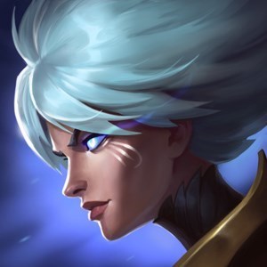
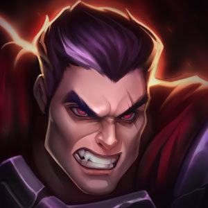
Katarina splash art comparison

Look at the differences between the 2 most recently added splash arts for Katarina. Why is it that one of them makes her look very lifelike with refined features that looks really attractive, while the other is one of my least favorite splash arts in the game now? The new vanilla Katarina splash art is honestly so disgusting to me given what we're used to from the character. I would even venture so far as to say that the in-game model has better detail and a more shapely face than the new splash. Isn't that the opposite of what it's supposed to be?
Can we go back to the old one?
Usually, when we update champion splash art, we go from a very cartoon-y low-detail older one to a shiny new updated one. 2 good examples of this are in Orianna and Blitzcrank. When they were updated, the new splash arts were much more detailed and less immature forms of the same idea.
This change seems like the exact opposite.