The Ryze TU

Acolyte of Steel·3/12/2015, 12:33:40 AM·70 votes·13,116 views
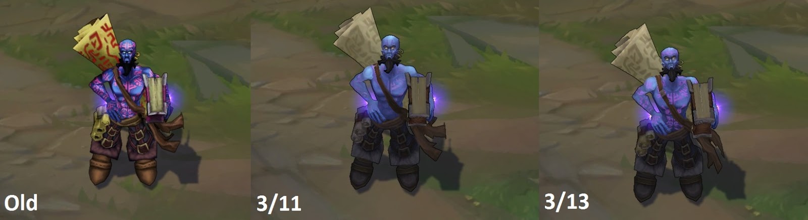
http://2.bp.blogspot.com/-iciFgEwh20g/VQCk6bAMIGI/AAAAAAAAllM/sHCQx1Ty1CQ/s1600/baseryzecompare.jpg

http://www.surrenderat20.net/2015/03/311-pbe-update.html#ryz1

THE PREVIOUS TU HAS BEEN FURTHER UPDATED. HOWEVER, I STILL FEEL THE POINTS IN MY THREAD APPLY IN FULL.

http://2.bp.blogspot.com/-R8NksS2o24I/VQNGpnNC_-I/AAAAAAAAmGw/7RaN0N61wdI/s1600/ryze3waycompare.jpg

Disclaimer: I understand this is PBE. However, since it's PBE, I feel the need to provide feedback to help solidify a preferred direction from someone who really enjoys Ryze's character.

I really don't think this is the direction you should be taking for Ryze's Texture Update. I think this TU has violated a lot of the things that made Ryze, "Ryze," and I've listed them here.

  • Ryze's runes are a CRITICAL part of his character! Now you can barely see them on his flesh - which is why he goes shirtless to BEGIN with - and the runes on his scroll look like they were written an hour ago with water! Nothing about it looks enchanted!
  • Ryze is supposedly a magical being, who's abilities scaled with mana for a reason! That's why his flesh is blue - He's a magical being who became so by filling every pore of his flesh with magic! His current shade of blue looks more of a* "powder blue"* than a "mana indigo."

It's easier to see his runes now, but I personally feel it's not quite enough. There should be some means of emphasizing them.

Other thoughts:

  1. I don't really like the 'pale blue vs darker colors' thing going on. It looks too edgy and it detracts from Ryze's emphasis on a "natural" sorcerer as opposed to an "educated" wizard or mage. The brown hides suit him well, though perhaps a slightly darker color palette is in order.

  2. His eyes don't glow as much. I think they should glow brighter to emphasize the powers within.

  3. His ear-rings should be a brighter color - I'm sure your artists wouldn't be able to stand leaving it as it is, but it should be said.

  4. I kind of like the crimson writing on the scroll. It makes it look truly accursed and worth sheltering from evil hands. Just what did they use to write that...? Blood...?! Who's blood?! Perhaps if you darken the red script, and make it look sickened black/corroded at the edges of the writing it will really drive the whole accursed thing home?

5 I guess) Not feeling the eyebrows, mayng. Personal opinion, but I think he looks cooler without them. : ^)

Notable Comments: http://boards.na.leagueoflegends.com/en/c/story-art/HJEskEkd-the-ryze-tu?comment=0002

http://boards.na.leagueoflegends.com/en/c/story-art/HJEskEkd-the-ryze-tu?comment=00120000

http://boards.na.leagueoflegends.com/en/c/story-art/HJEskEkd-the-ryze-tu?comment=0002000100010000

http://boards.na.leagueoflegends.com/en/c/story-art/HJEskEkd-the-ryze-tu?comment=000e

http://boards.na.leagueoflegends.com/en/c/story-art/HJEskEkd-the-ryze-tu?comment=00050000
67 Comments

kitcat3003/12/2015, 3:03:20 AM18 votes

The art team has listened to community feedback many times and it only just hit the PBE today so I wouldn't be to worried.

And yes I agree the runes need to be more visible.

DG Ashabel3/12/2015, 1:36:46 AM14 votes

As sad as I am to say this, I feel like Ryze's tattoos are the ultimate step in driving home the point that Riot doesn't give a shit about lore or the game's art direction.

Ryze's tattoos are not only the source of his powers and a major part of his character premise, but they are also is strongest visual identifier. Removing them is like removing the cowl from Batman or the cerulean backpack from Blue Beetle. They're what makes the character click in visual media. Seeing them gone is such a jab in the eye of artistic integrity that it feels like nothing in the game except eSports matters anymore.

Oh well, HOTS has opened up the doors, Infinite Crisis is almost out of beta and Dawngate's former project lead mentioned that he'd seen some very interesting new MOBAs at GDC. Hopefully the lumbering beast of the competition will make Riot Games wake up at some point.

Derpy Mike3/12/2015, 9:53:41 AM4 votes

Ryze I got these tattoos in rune prison!

Kassadin Yeah, that's okay, Ryze, I understand your pain. My joke doesn't make any sense either.


gr8job3/12/2015, 10:00:11 AM3 votes

I understand what they're going for here-- unifying the champions aesthetically. Newer champions don't have such bold color contrast, exaggerated shadows, and small details that become rather murky from the distance at which the model is viewed in game. But I think Ryze's update is just awful, dull and colorless. The smoothness and soft lighting really brings him up to date, but I think they should experiment with adding more color that translates well at a distance.

IMTOOJUICY3/12/2015, 5:03:45 PM2 votes

"I got these henna at rune prison!"

JedenVojak3/12/2015, 1:37:35 AM2 votes

If the brightness of his runes represent his arcane power, then perhaps the rebalanced runes are more indicative of his level of power right now.

;D

Tesla Effect3/12/2015, 1:41:41 AM2 votes

I also think its a bit late too complain about this, since well.....Twist of Fate cinematic has showcased the new Ryze, and that thing was 2 years ago.

cFlame3/12/2015, 8:40:05 PM2 votes

Riots artists should stop removing the flashy details out of champions, just because the balance team does the same thing to every champion they don't like doesn't mean that you should do it too.

Jeddy0173/12/2015, 1:41:00 AM1 votes

I think we should remember that Ryze is slated for an eventual VU (along with a gameplay rework).Yes,the TU could be done better.But it's eventually gonna get replaced.

EDIT:It was mentioned here http://boards.na.leagueoflegends.com/en/c/gameplay-balance/s3Ae7ec8-champion-update-update-13015

NorthernDruid3/16/2015, 12:55:20 AM1 votes

sigh Even with the touch-up his tattoos look so indistinct, and the writing on the scroll is still water-on-sand.

I hope they tweak him some more, 'cause beside those details he looks really nice (even if his skin is realy too light).

EverTokki3/12/2015, 8:46:33 PM1 votes
S H A Y C 03/12/2015, 10:23:41 PM1 votes

"it detracts from Ryze's emphasis on a "natural" sorcerer as opposed to an "educated" wizard or mage."

What would a natural sorcerer need a giant spell book and a huge tarp with spells on it for....only a an educated wizard that needs incantations and materials to casts spells would use such a thing. Soooo.....if we accept your reasoning, we have to ditch those too im afraid.

the lighter blue is the least offensive issue here. I think the note you made about the runes not being visible is a bit of an issue for me and should be for everyone. its like removing the bark from maokai...you just cant and shouldnt do it. thats the only thing i see really wrong with it, he looks a lot smoother so i say just accent those runes a bit more, maybe give them a little shimmer or something.

John Berserk3/13/2015, 2:01:47 AM1 votes

When are people going to finally understand the difference between a Texture UPDATE and a Texture REBALANCE?

This is NOT a TU, this is a TR. This was NOT done by the skins team. This is NOT delaying or cutting into the time/resources for his eventual full-blown VU/GU (gameplay update). This is a super temporary band-aid fix just to make him look slightly better on the current SR, that's all.

I repeat, this is NOT his visual update. This is **NOT **a texture update. It is a texture rebalance.

BeatzBoyFTW3/13/2015, 8:44:26 AM1 votes

Wow, he looks so......blank.

Acolyte of Steel3/13/2015, 11:33:55 PM1 votes

I've updated the OP for the edits as of today. Bump for discussion! This thread still applies! :)

inmUGco3/14/2015, 12:08:27 PM1 votes

In R Ult Tattoo brighten

junglerboy163/12/2015, 1:12:54 PM1 votes

To be fair, old Ryze's skin looked purple, not "Mana blue", and he has always been blueish purple in every cinematic and splash art. I just wish his colors popped a little more, like how they do in his splash art (which is actually one of my favorite splashes in the whole game).

Other than that, I agree the runes and writing on the scroll are too faded looking and need to be livened up. I actually like his new trousers though.