the end of season summoner icons are ugly and dissappointing
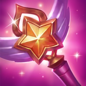
It seems like the approach taken was "Start off with an amazing looking icon for the highest tier players, then keep removing details from it to get the next lowest tier's icon, and continue that process until you end up with absolutely hideous, boring icons." I get that challenger players deserve the best icons. That doesn't mean everyone else's has to look garbage. Even the one for diamonds is hideous. They're SO underwhelming that when I saw them, I had at first thought the master icon was for plats.
The 2014 at the bottom is especially hideous, what's worse is how empty they all look, other than the challenger one of course, which looks fantastic.
I was sad enough to see team-only ward skins. I don't know, I don't personally play on a team, I dunno how many other people do so I left that one alone, but for the icons to get less detailed based on your ranked 5's > ranked 3's > solo queue makes it seem like solo queue achievements are unappreciated